ASSEMBLY APP
Case Study
01
PROJECT OVERVIEW
Project Brief
The product:
Every homeowner's and renter's main concern when doing DIY projects is to seek the right experts or doing own research. With Assembly App, it will help them build their confidence, save time, and money to fix minor home repairs or DIY projects.
Role
Lead UX Designer, Researcher, and User Interface Designer
Project Duration
3-4 weeks
Outcome
This case study was a personal project in partial completion for UX Design certification for Google Coursera.
Tools
Figma | Photoshop | Illustrator | Miro | Canva
Responsibilities
User research, visual design, wireframing, prototyping, user testing, photographer, video editing,
Background of the project
The product:
Every homeowner's and renter's main concern when doing DIY projects is to seek the right experts or doing own research. With Assembly App, it will help them build their confidence, save time, and money to fix minor home repairs or DIY projects.
The Problem
The amount of information across the internet has caused much confusion for users; this includes the browsing experience of a reliable source for instructional home DIY projects. While there are plenty of resources on the web, design calls for a centralized user experience targeting homeowners or renters needing easy direction for various home projects.
The Goals
To design an application for an easy-to-follow home project and conveniently perform tasks within a single application.
We are designing streamlined browsing and instructional material lists for a given project.
02
Understanding the user
User Research
Personas
Problem Statements
User Journey Maps
Research Process
User research
I conducted a user survey with 7 participants to understand how users approach DIY projects for their homes. Interviewing 5 participants helped determine the importance of technology in the current generation.
Personally reviewed 5 participants, observing their user flow towards browsing a project and getting ideas on how they navigate within their desired application..

Empathy Mapping
To identify what pain points users were facing, I decided to consolidate what common triggers and responses would help me design a product.

Common themes during interview
It is observed that 2 out 10 participants have formal mentorship that they meet once a month. This means it will be beneficial that our tools can provide them with the right help for mentoring.
4 out of 5 participants would research required materials for a project they are working on and prepare to shop for it.
10 out of the 10 interviewees were knowledgeable about the mentorship but not able to acquire a consistent network of people that matches their needs.
It is observed that 5 out 5 participants would do research on their own before doing the home repair task and rely on whats available online.
“I think if I have any supplies at home already before truly approaching the issue. So I know whether I can finish in one go. And if it’s more than what my mind can think of solutions then I start searching online.”
Pain Points
INFORMATION
Most users struggled with finding the correct instructional video for their DIY home improvement projects.
EASE OF USE
The user mentioned confusing instructions; the design calls for an informative UI combining written and video playbacks.
SAVING TIME
Most participants have a busy schedule and want to do their project at their own pace.
EXPENSES
With high cost of hiring an experts, some user felt doing the project on their own.
How might we?
How might we design an informational app that will be an instructional UI that will help build confidence for users, and save time and money for a DIY project?
Hypothesis
If users can easily get directed to the right instructional media for home improvement DIY, it will help alleviate information overload and focus more on promoting user confidence with their home projects.
Solution Features
Easy onboarding users
Walkthrough information about the responsive application for home improvement DIY.
Device content-focused and straightforward platform so users can avoid confusing information.
Filtered projects
Allowing users to click on the type of project easily will create a more navigable application.
List of projects including images that will push for the right content direction.
Interaction with consumer
Allowing users to post reviews about the media to showcase other user experiences with the said project.
Information Design
Designing video playbacks and written instructional material for user flexibility if contents were preferred to be read or watched.
Why ASSEMBLY?
The branding itself relates to builders and homeowners combined. A platform that will help users build confidence in all their DIY home improvement project needs without necessarily hiring professionals for an easy DIY task.
Creating Maxine, as the user persona
AGE: 25
Education: Computer Science Major
Hometown: Oakland,CA
Family: Single
Occupation: IT Intern
“I was browsing on Youtube on how to fix drywall that does not need experts to work on. I find that there’s a lot of videos to choose from, and I kind of got lost with whom should I rely on.”
Maxine Jones lives in San Carlos and she is about to move out to another place in San Francisco. The landlord expects her to leave the space neatly and she was planning to do some repairs on her own due to budget constrains. Maxine learned after her first ever apartment, someone she hired previously contracted her large amount of money to do an easy task. She was looking for a reliable resource online so she can confidently DIY home repairs.
Aspiration:
Maxine wants to fix her own drywall without hiring expensive contractor.
User knows what to look for but wants to have a simplified instructions.
User wants to be informed without getting lost on the internet.
Frustration:
User felt frustrated watching different approaches on her home DIY project.
Maxine felt struggled finding a reliable source.
User felt discouraged purchasing unnecessary tools and materials for her own DIY project.
“If Maxine can use a reliable online tool for her home DIY source, she can confidently proceed with the home improvement project without the need of hiring a contractor.”
03
Starting the Design
Paper Wireframes
Digital Wireframes
Low-fidelity Prototype
Usability Studies
Low fidelity prototype

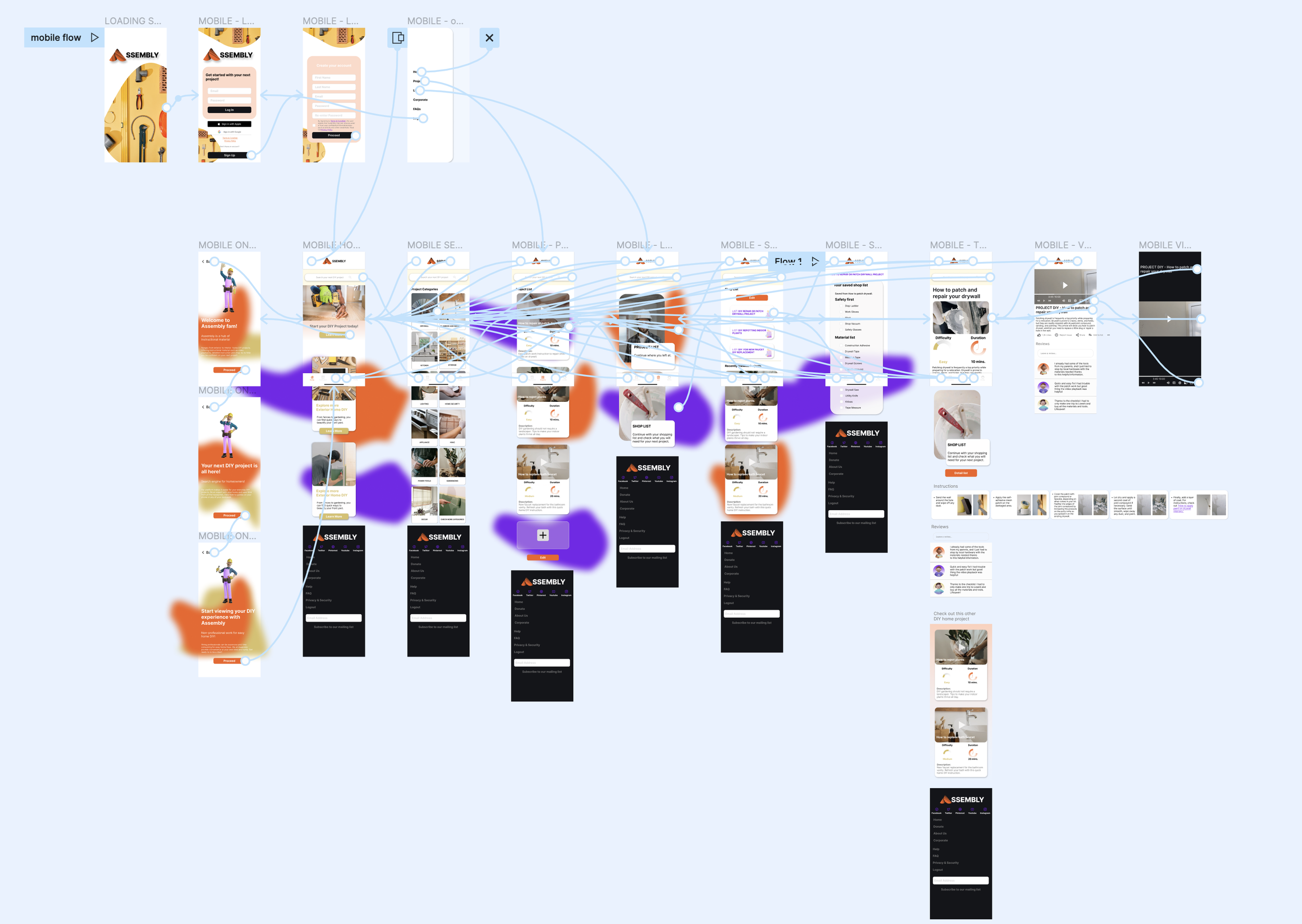
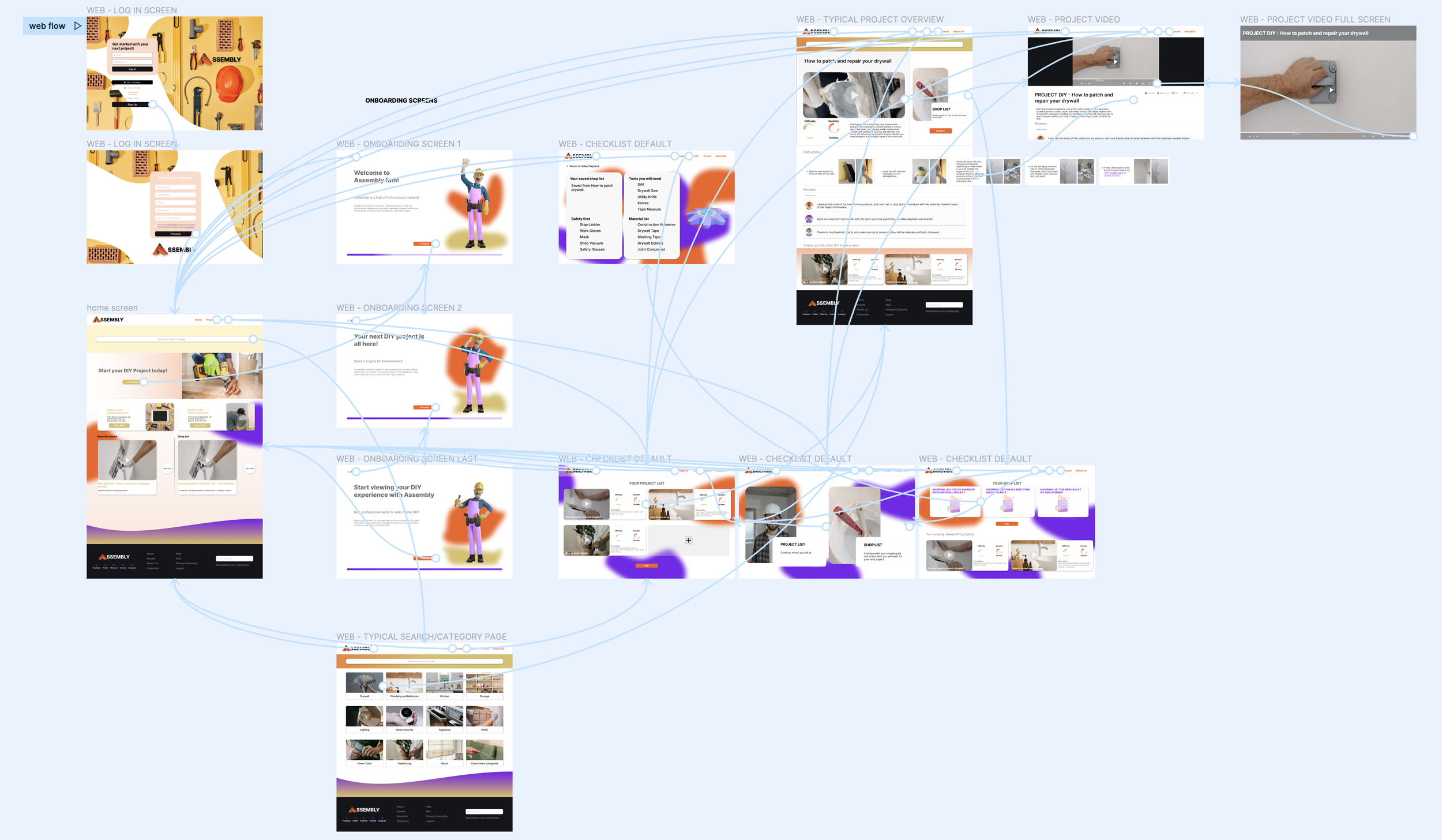
Planning the wireframe and flows of the onboarding experience. Early testing experience for users to expand interaction and design needs.

Low Fidelity Prototype

Designing for progressive enhancement helps with the UX responsive design. Scaling up the design allowed for a web version experience so users can easily view tasks on a larger screen while using a mobile device for a quick browsing guide when shopping required tools/materials outside.
Usability Studies
I decided to conduct usability testing 4 participants at this stage of the project. I captured UX refinement from conceptual wireframes and necessary interaction design before hopping on to hi-fi design. I decided to conduct moderated usability testing due to the early stage of the concept; content writing was not entirely in place. Still, the necessary interaction for the prototype will help users get a clear walkthrough of the product.
First Round Findings
2 out of 4 suggested that the mobile experience felt more condensed in writing and spacing.
4 users were able to get through each navigation bar without trouble.
1 user felt returning to another screen was needed for each onboarding screen.
Second Round Findings
4 out of 4 users suggest instructional material rather than just playback video.
User experience required more interactive and contrasting buttons.
At this stage of research, users were able to complete the task and able to explore the home screen and potential creation of the product.
In this session I concluded:
Refinement of the web interaction button will help produce a sense of direction to a clickable prototype.
Instructional material such as information design needs to be incorporated on the playback page to provide flexibility for users when switching from devices.
Increasing typographic and visual hierarchy to prevent confusion while carefully placing content altogether.
04
Refining the design
Mockups
High-fidelity Prototype
Accessibility
Mockups

Design Systems
Typography


Color
Iconography

High Fidelity Prototype
Mockups
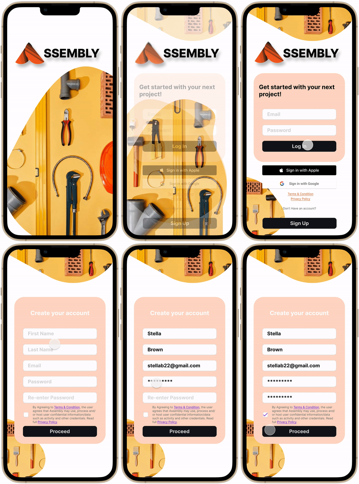
Log In Screen
Adapting to easy sign up experience, users have flexibility in using existing Apple or Google account to sign in.
Onboarding experience
Information design incorporated to quickly walk users through the
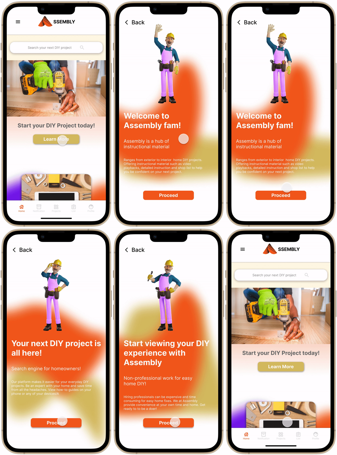
Home Screen
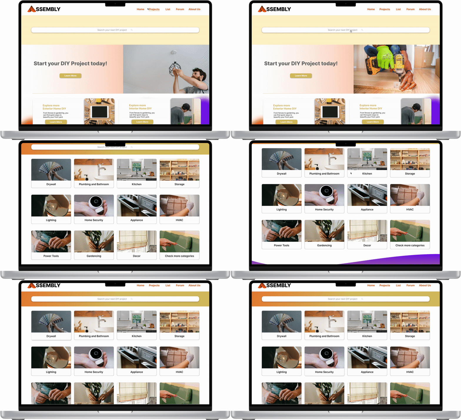
Setting the tone of the platform by using real images of DIY users and adding readily accessible onboarding experience on the main page.

Search Screen
Filtered project readily available on browsing experience.

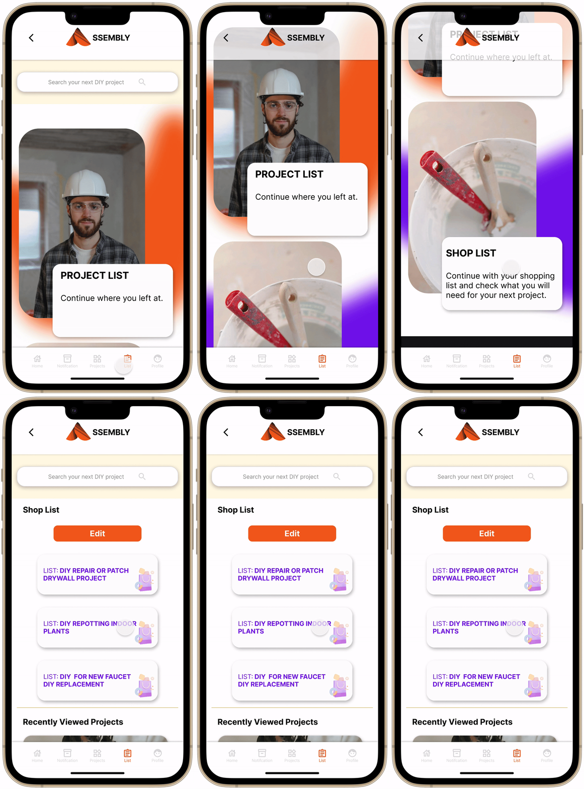
Main List page
Editable project and list for users to save their progress and next DIY project.
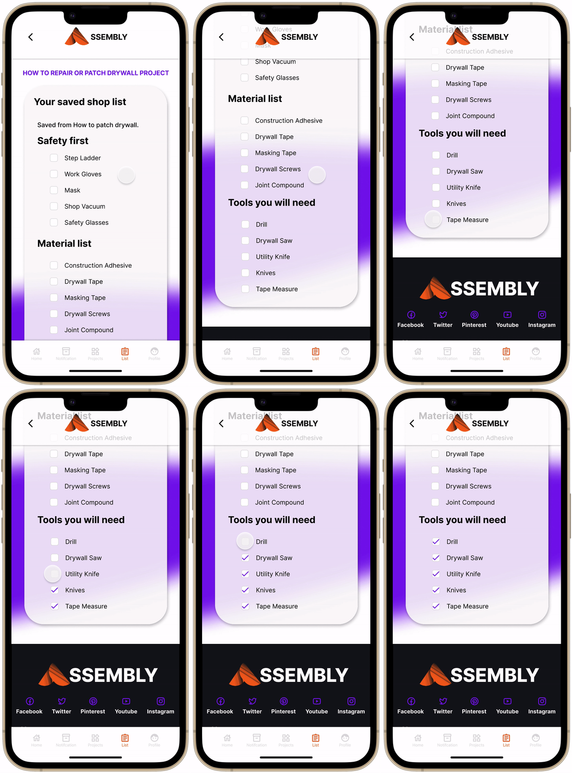
Typical Checklist Screen
General overview of products they saved from the last project users were interested in.
Typical Product Screen
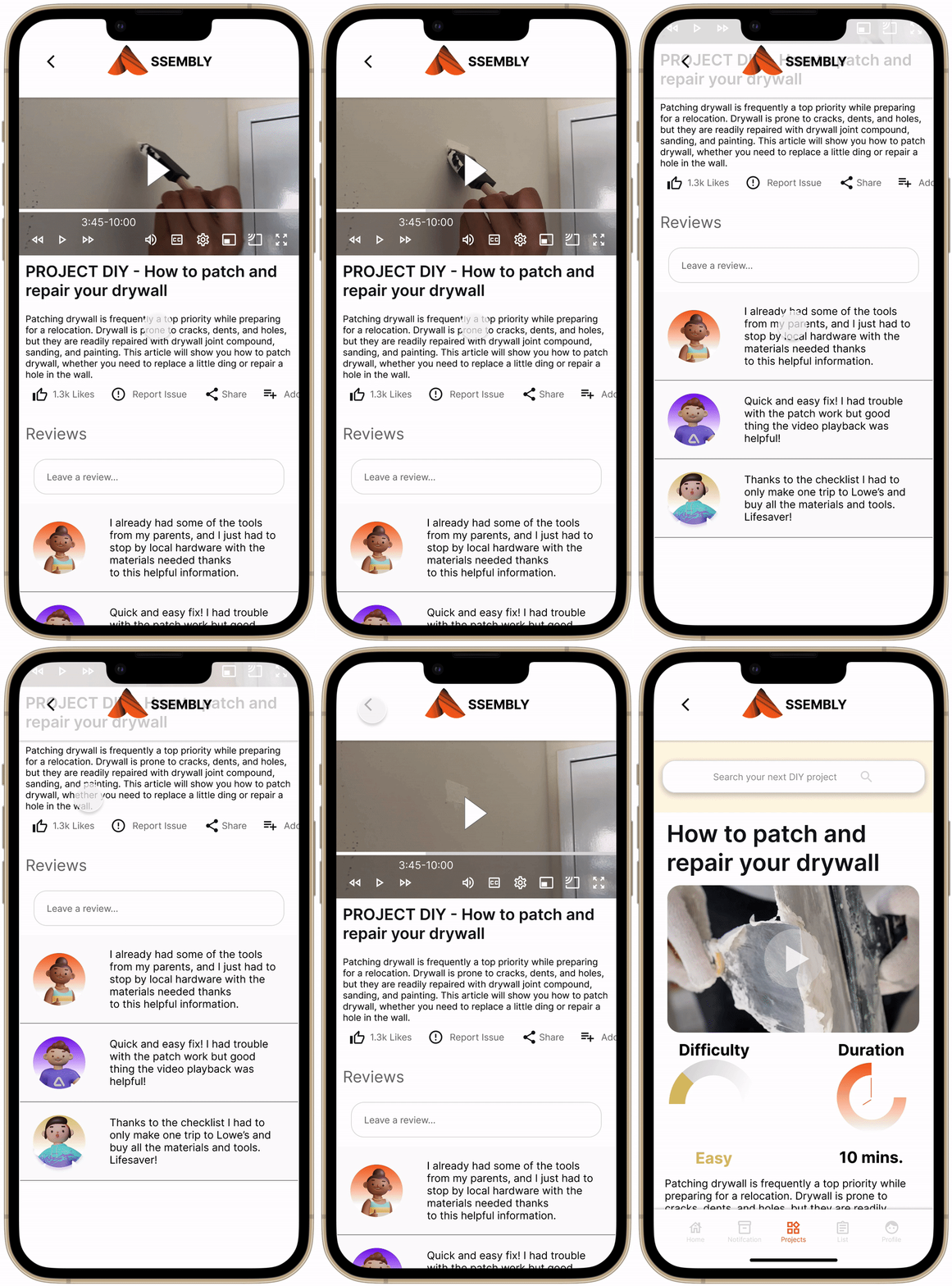
Instructional overview of the project for easy project walkthrough while also incorporating video playback and review contents from previous users.

Video Playback Screen
Video playback and overview of the project.


Reflection
Takeaways
I was able to explore responsive design development. I learned that progressive enhancement made the refinement from mobile to the web more accessible to design than from web to mobile. Due to the minimum number of user participants, usability testing was my main concern, but I gained user insights that helped me shape the final product. I struggled particularly, yet it pushed me to explore Figma and expand interaction design from different devices.
If I had more time, I would expand my user testing to more significant participants and acquire more data for this product. I would explore business models to launch this product in the market. Which brand partners will the product advertise for the users' shopping needs? How would we profit from application traffic? What type of marketing ads help fund an informational tool?


