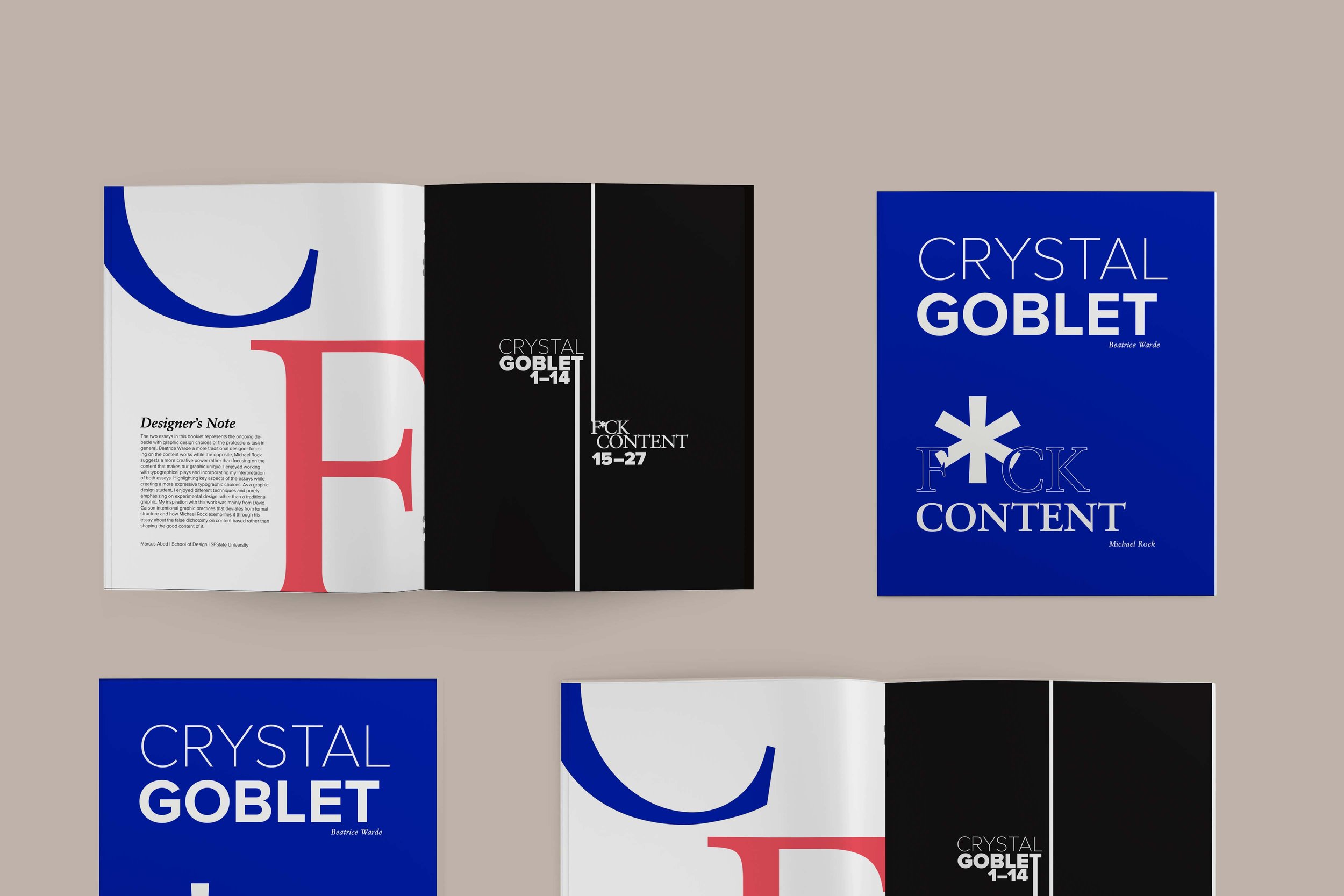
Typography: Crystal Goblet and Fuck Content
Project Brief
The goal of this project was to create a typographic book.
Project Outcome
This project was presented in DES 425 - Graphic Design II
Duration
3-4 weeks
Role
Visual Designer
Tools
Adobe Illustrator, Photoshop, Indesign and Procreate
Project Overview
The two essays in this booklet represent the ongoing debacle with graphic design choices or the professions task in general. Beatrice Warde a more traditional designer focusing on the content works while the opposite, Michael Rock suggests a more creative power rather than focusing on the content that makes our graphic unique.
I enjoyed working with typographical plays and incorporating my interpretation of both essays. Highlighting key aspects of the essays while creating a more expressive typographic choice. As a graphic design student, I enjoyed different techniques and purely emphasized experimental design rather than traditional graphics.
My inspiration with this work was mainly from David Carson's intentional graphic practices that deviate from formal structure and how Michael Rock exemplifies it through his essay about the false dichotomy on content-based rather than shaping the good content of it.
Brainstorming and Visual Research
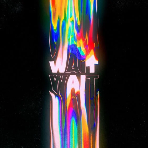
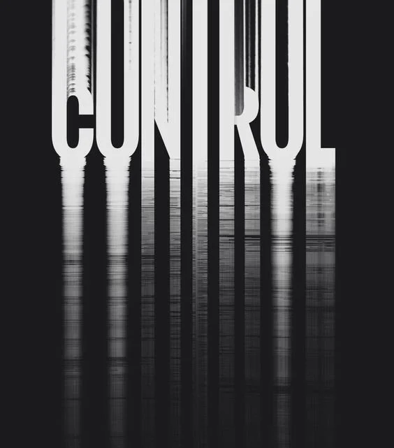
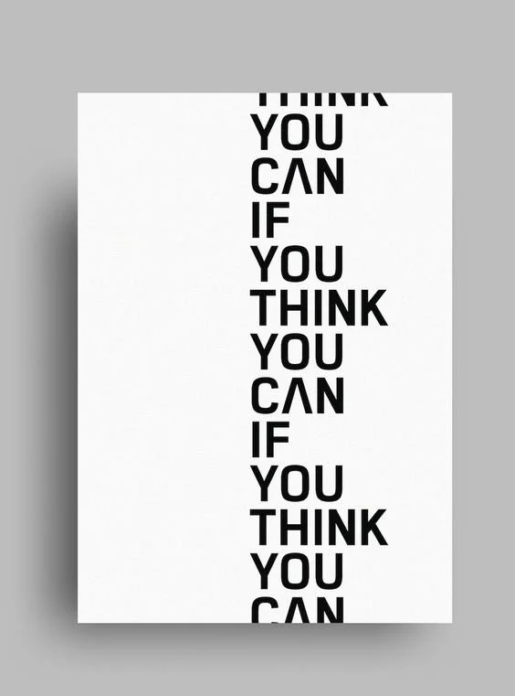
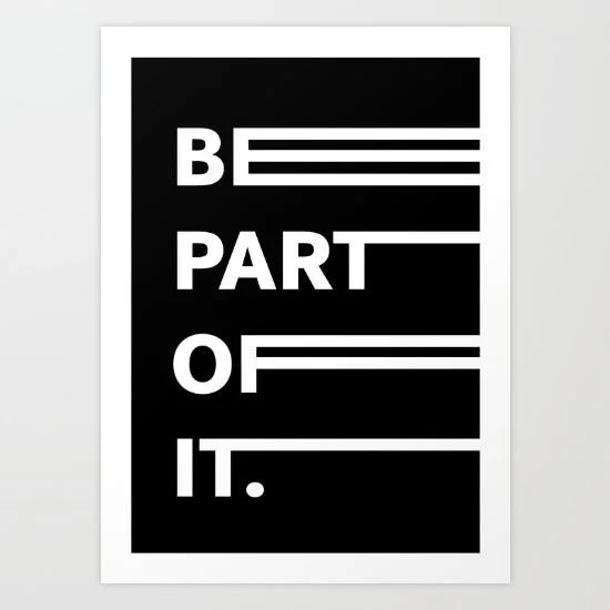
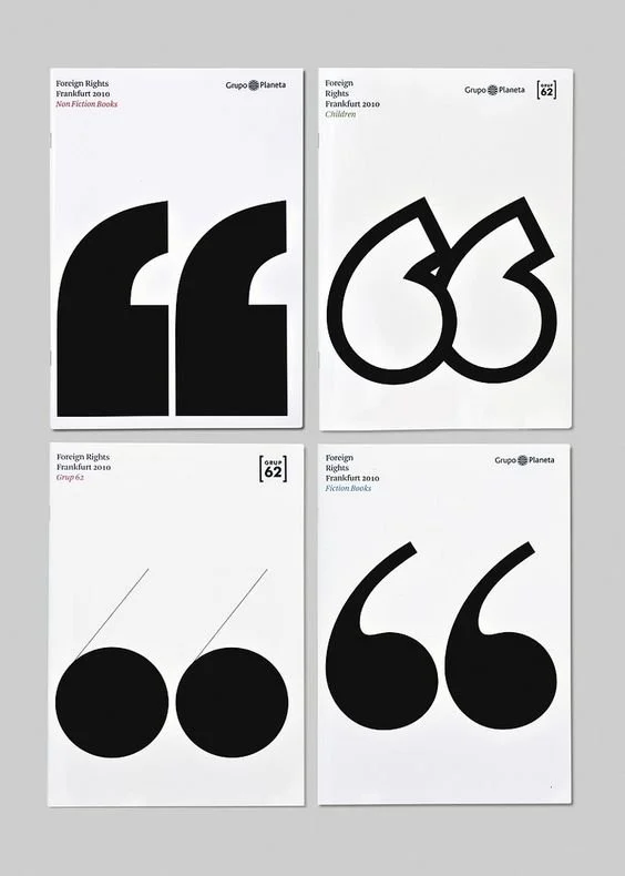
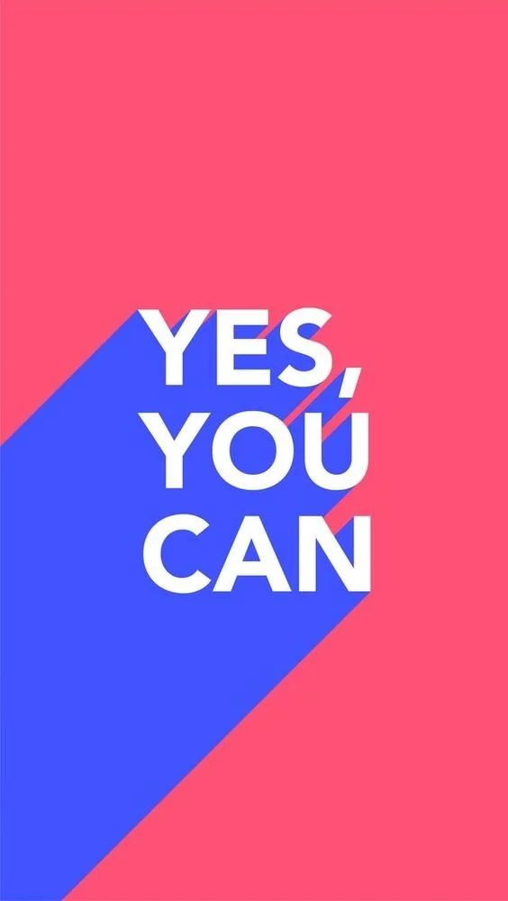
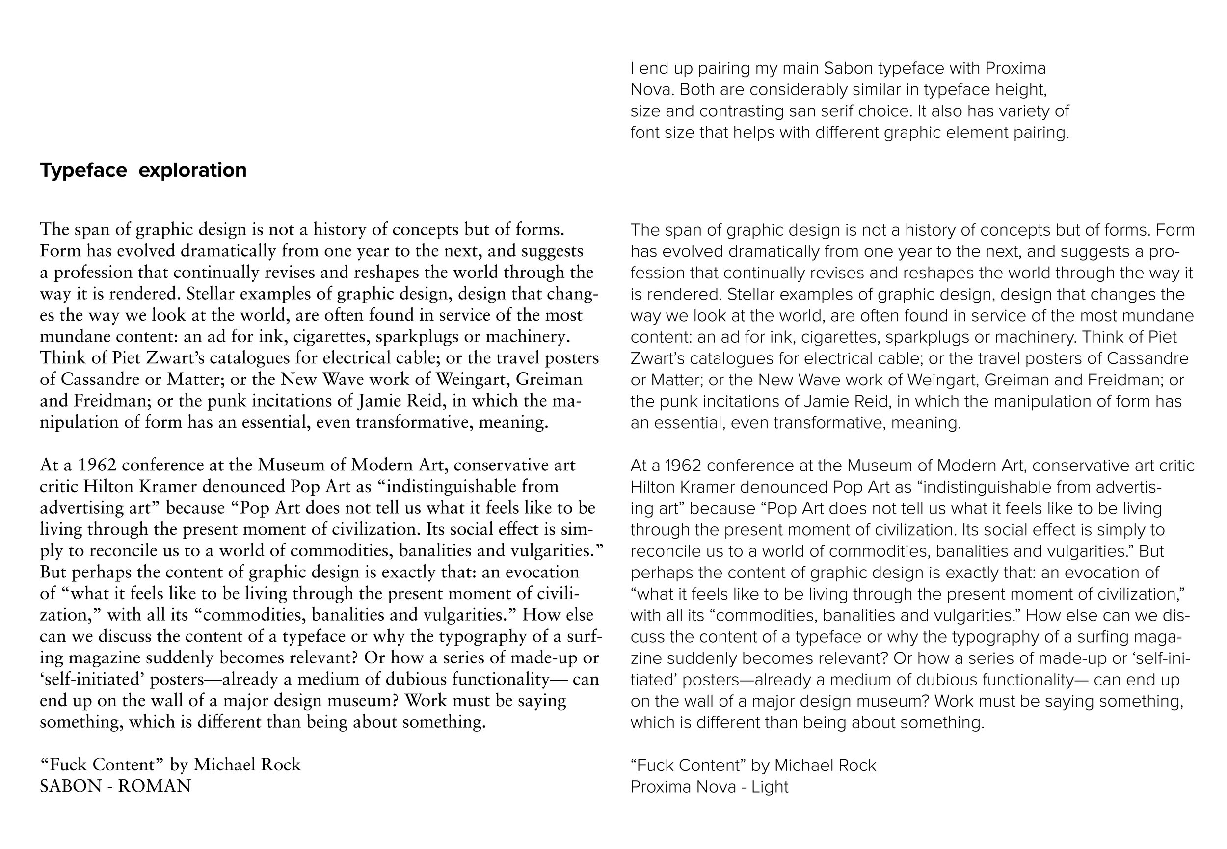
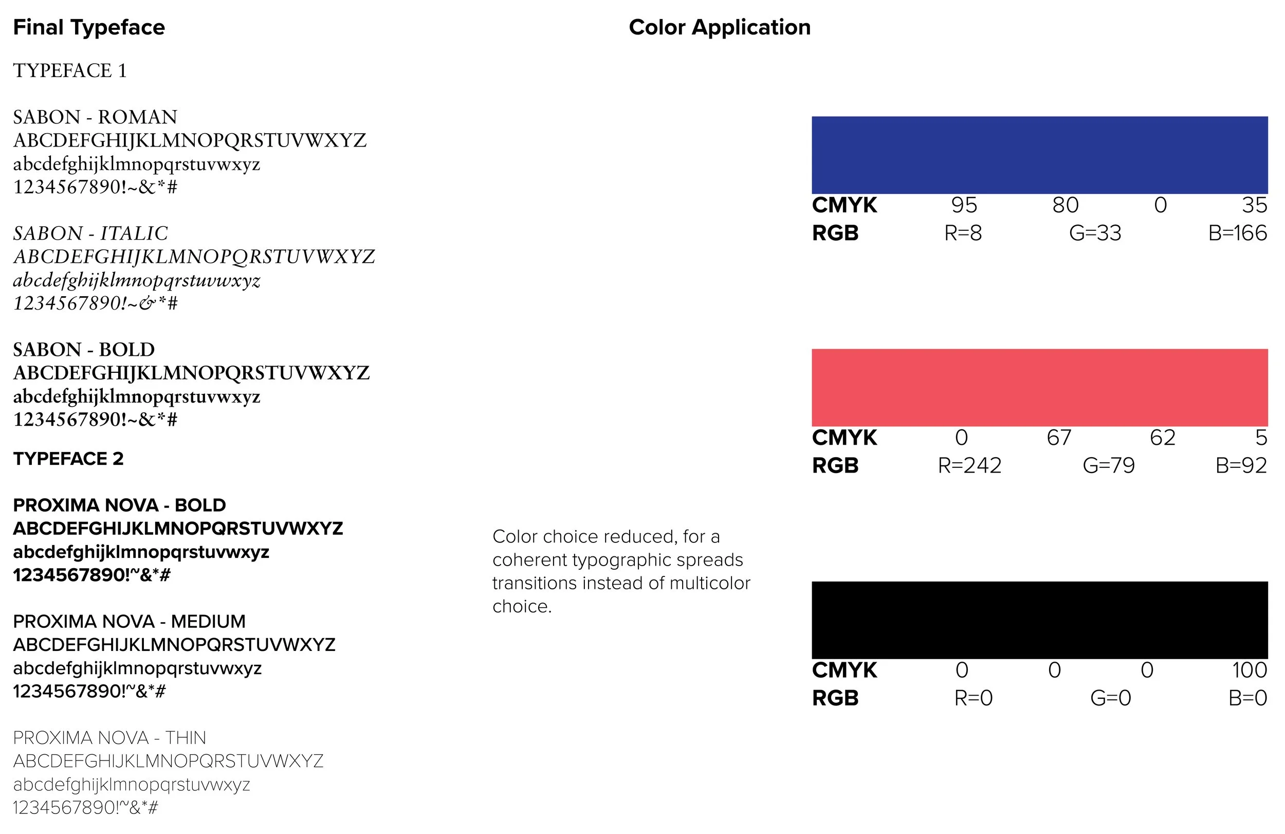
Several images were referenced as an inspiration for the typographical play. I was able to collect visuals that will help me guide in incorporation graphical elements. Images were sourced from Pinterest. I felt explorative with the typographical choice so I decided to experiment formal and informal elements within the booklet. It challenged me since there is different approach for me to curate cohesion of bodily text and highlighted messages.
Crystal Goblet by Beatrice Warde
Formal, Wordy, Content heavy, readability, legibility
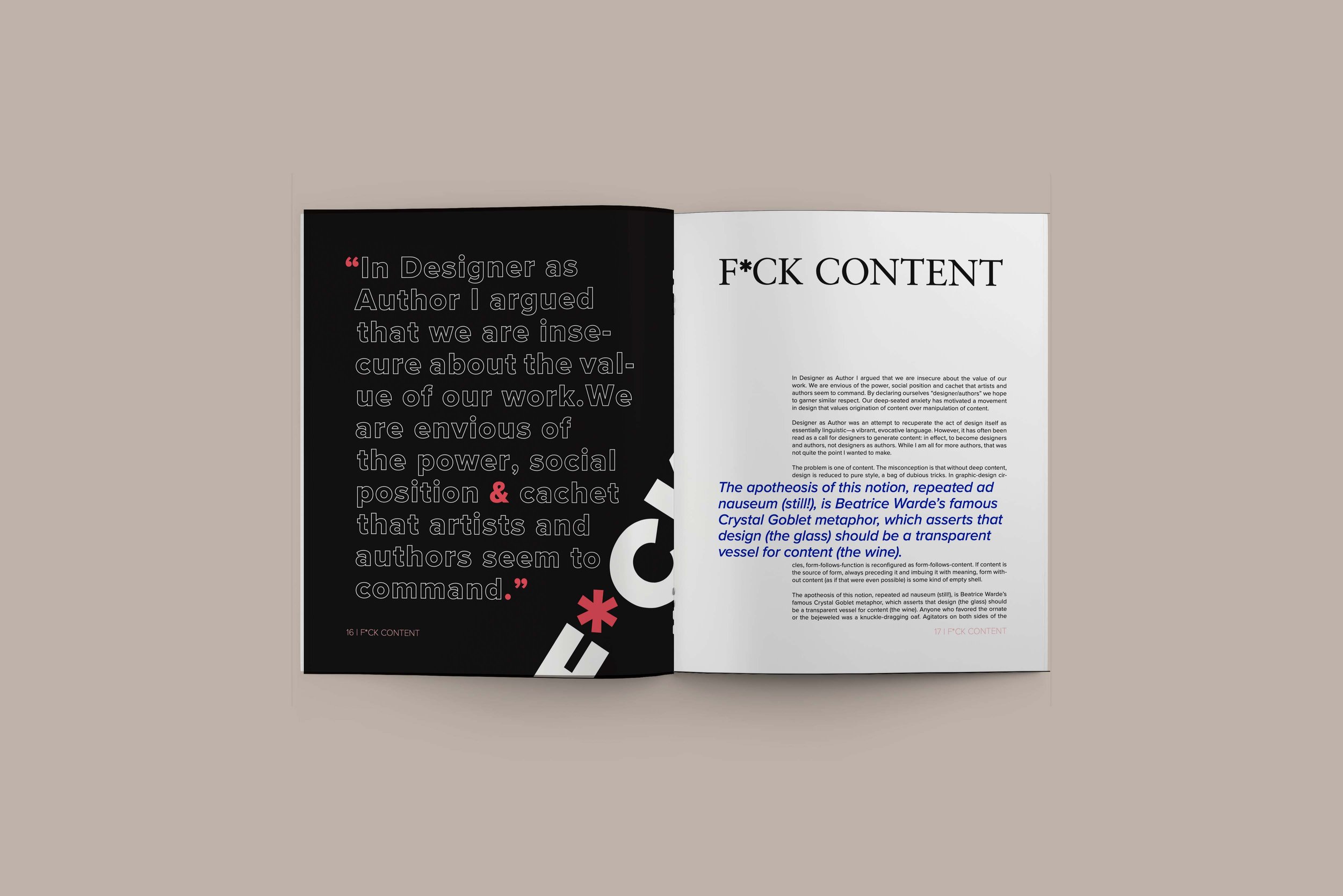
Fuck Content by Michael Rock
Bold, Graphics heavy, Wild, Informal, freedom
1. The first part of the presentation will showcase contrast in direction. Emphasizing on the similarities of Fuck Content and Crystal Goblet. Knowing that both amplifies the graphic design professional take on presenting creating inputs rather than just focusing on contents.
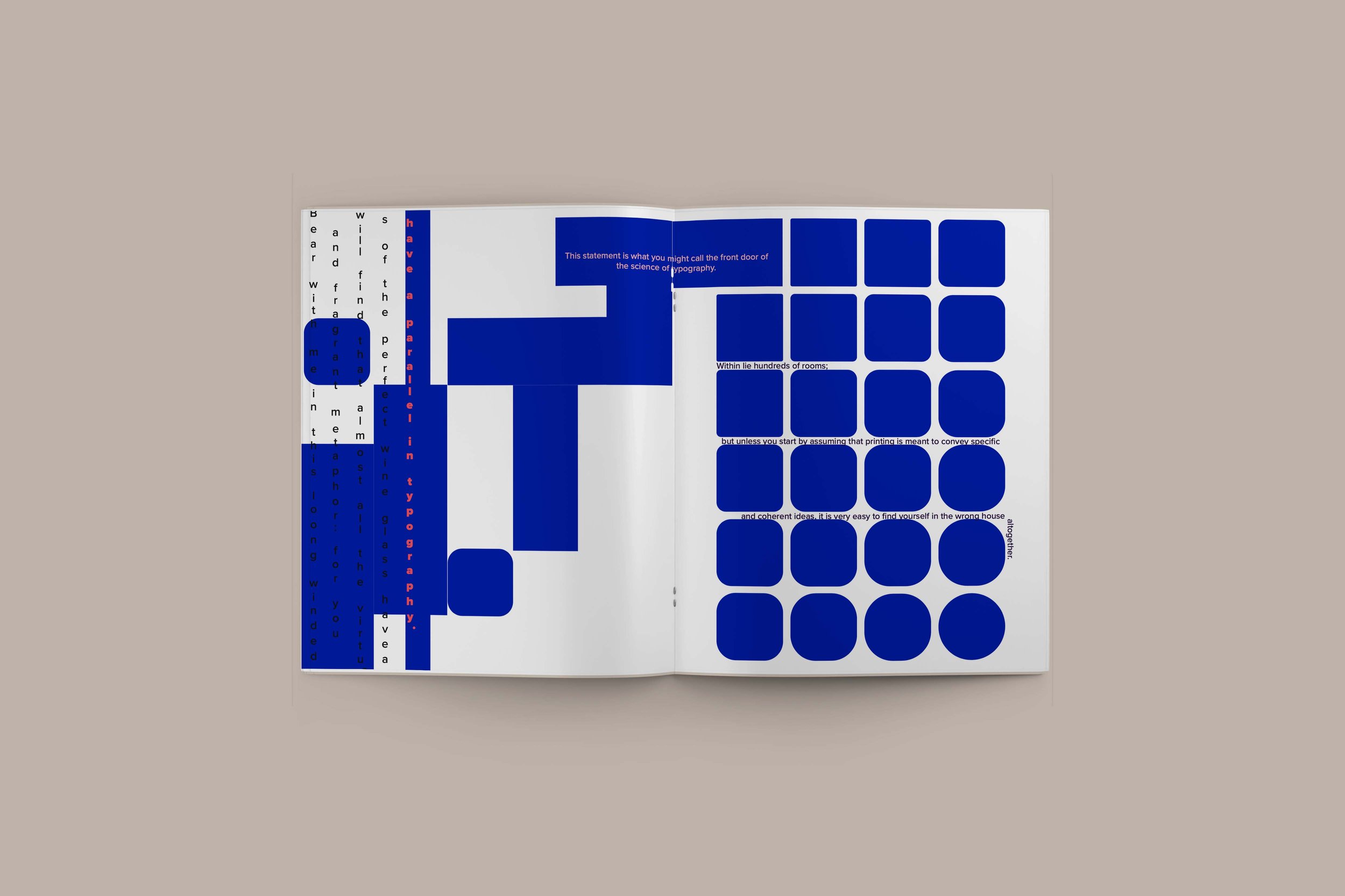
2. In contrasting texture pages, I will be focusing on Michael Rock’s work. Making this spread as graphics heavy rather than content.
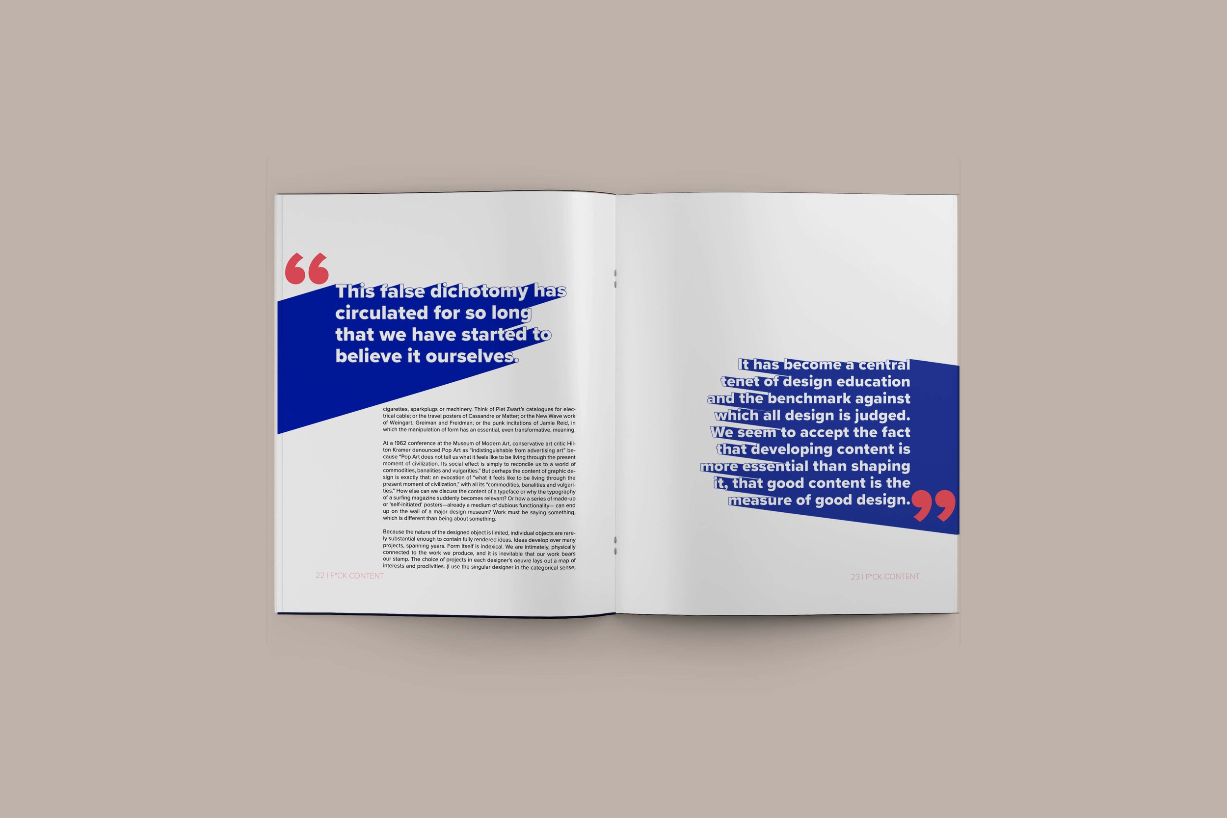
3. I will be using heavily on typography weight contrast for the spreads 5-6. Highlighting important statements from each readings into a larger font.
4. For contrast in Size, I will be criticizing Crystal Goblet, how it contradicts the idea of going back with creative heavy inputs rather than just the content.
5. Contrast of color spread will be highlighting Michael Rock’s idea again over graphical work.
6. On these last two spreads, I will be sharing important take aways from the two readings. Integrating my viewpoints as part of the content will adding contrast by structure and form.
7. Lastly, I will have fun creating different levels of contrast using Carl Dair’s principles. Using typographical contrasts and utilizing different elements to effectively catch reader’s attention.
Typographic Exploration
LOW-FIDELITY PAPER PROTOTYPE
My paper size exploration suited for the project. I chose the Full-cross octagon 10.3” x 8.5” so it will give me flexibility to perform exploratory graphic.
Final mockups




Make it stand out.
-

PRODUCT DESIGN
My range of creative visuals see more of my work!
