Easy Breezy
Rebranding Design
Project Overview
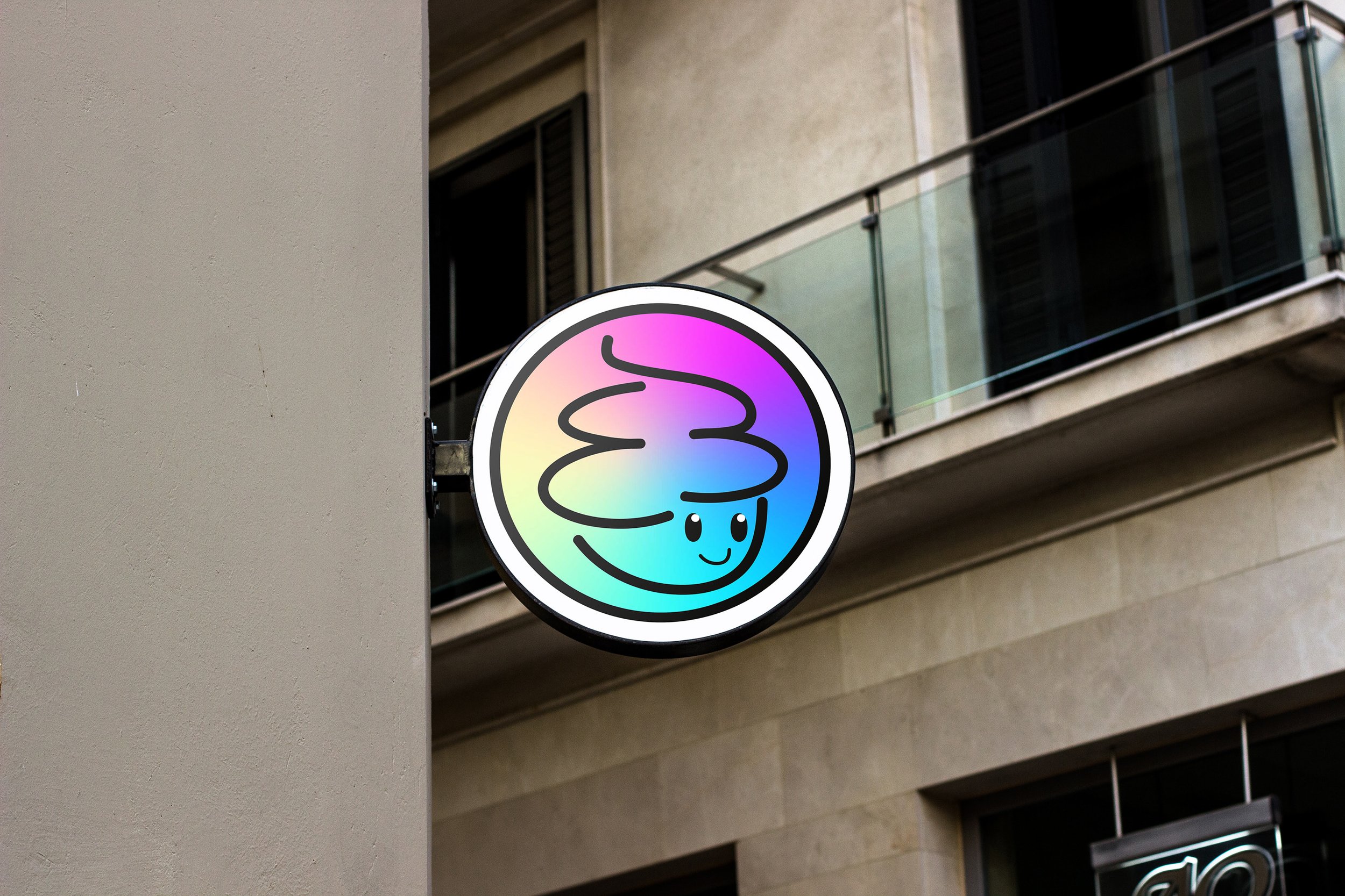
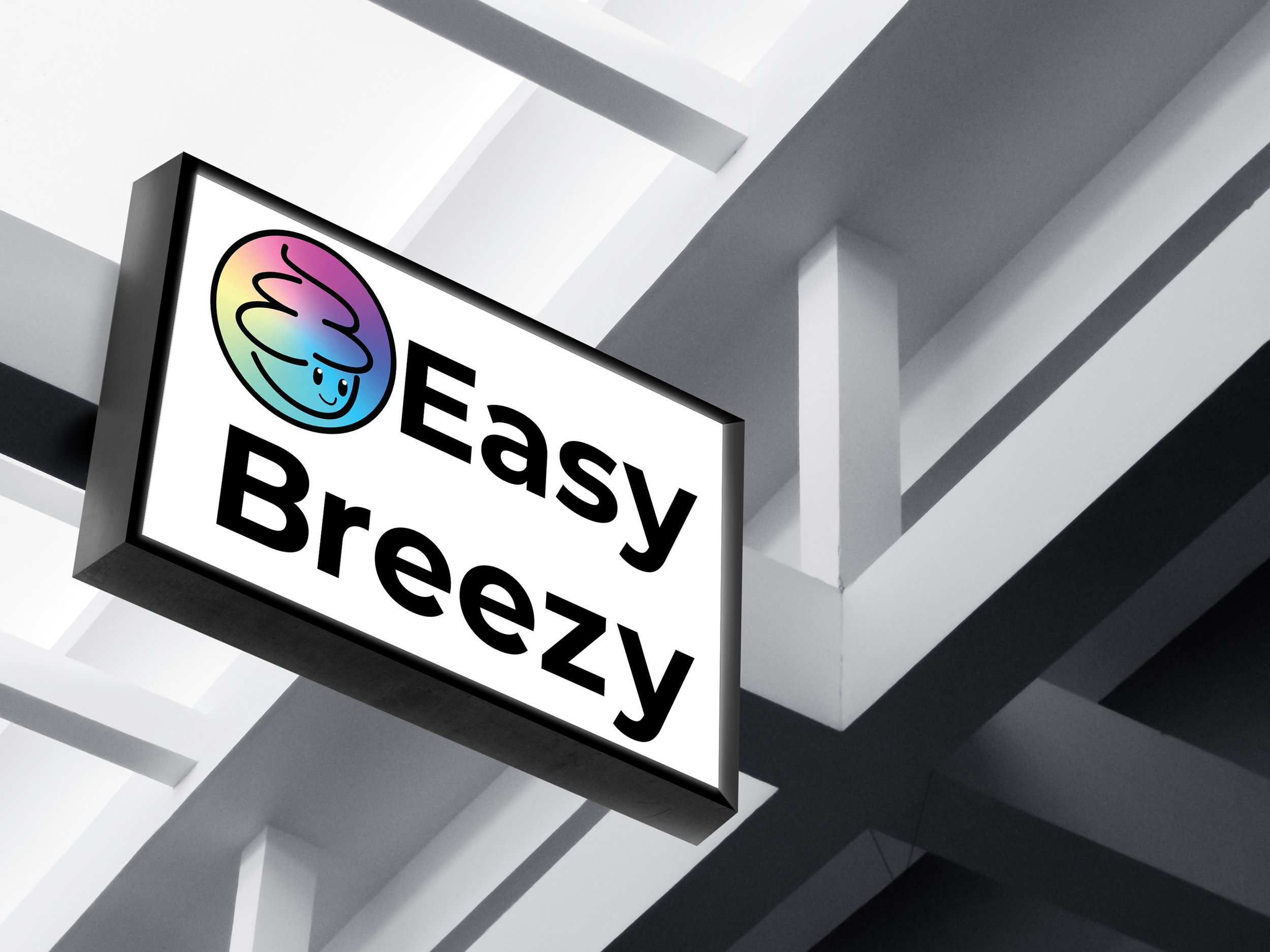
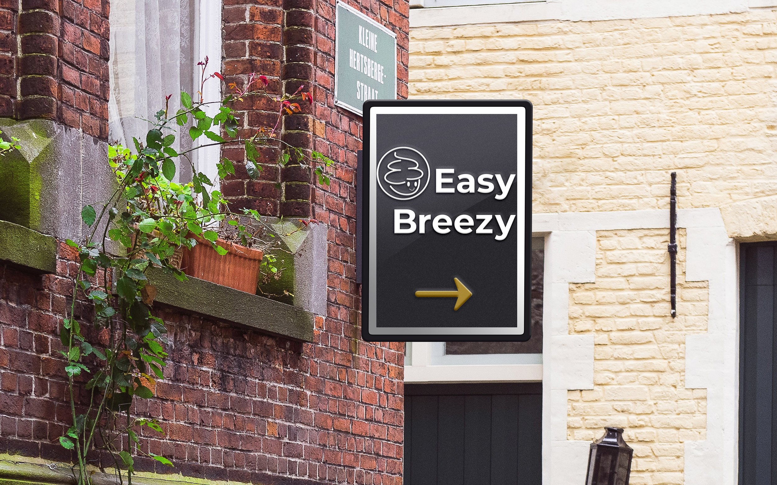
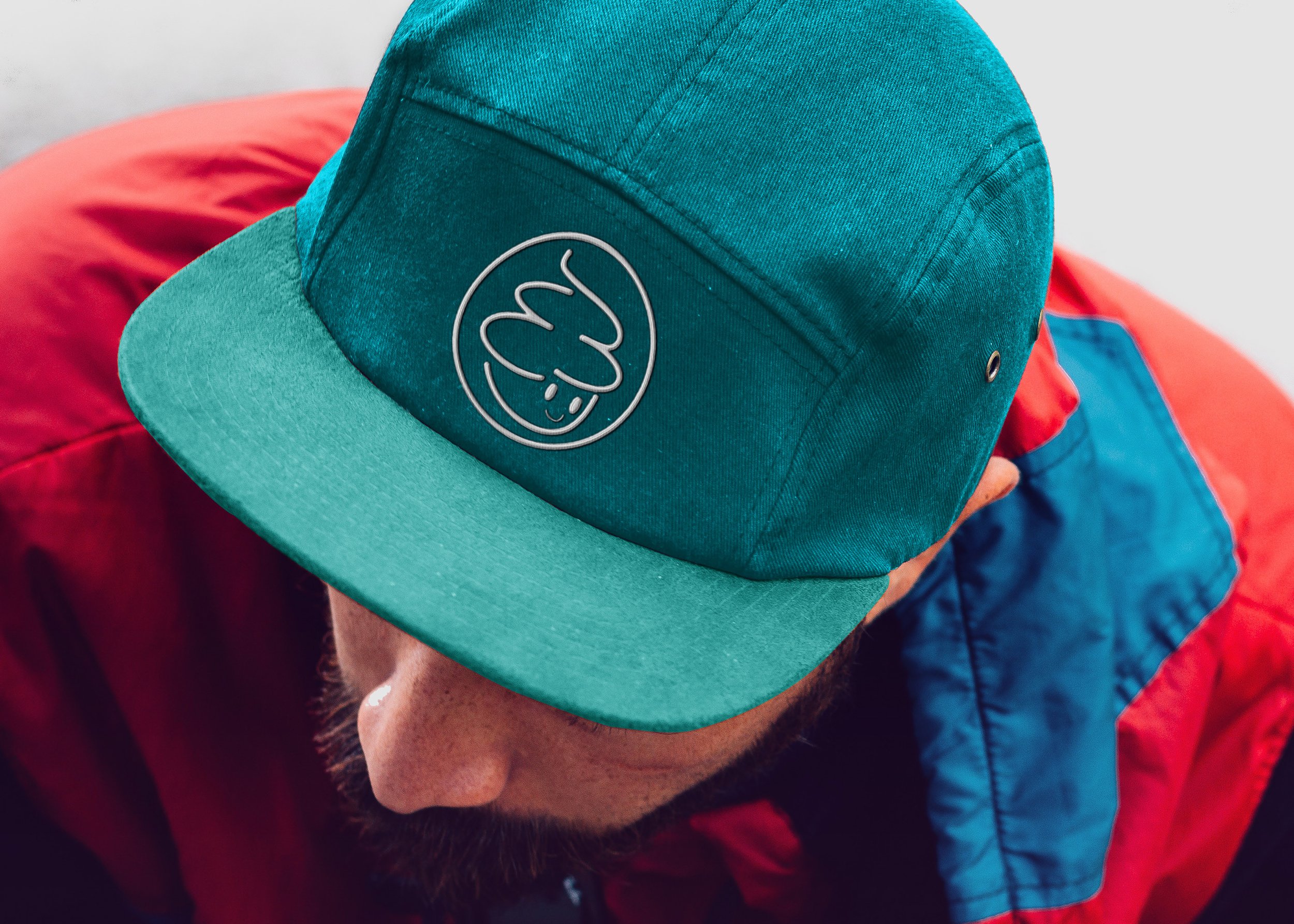
I redesigned the Easy Breezy Mascot Logo to a more simplified and eye-catching brand.
Easy Breezy is a family-friendly frozen yogurt store that allows its consumers to select their own yogurt and toppings. It attracts consumers of all ages and appeals to general public.
There is a need for redesigning the logo and color choice for Easy Breezy after finding its daytime and night time presence. It does seem flashing in the sunlight as the colors are too muted and monochromatic light blue and white, not enough contrast to its shop but the light blue hues does show and attractive. As it goes night time, everything seems dulled with its presence.
Its been a decade since it opened and mostly catered San Francisco, it does need a new look for a more fresh and unique brand. Introducing new colors such as pink, orange and lime while keeping the blue signature but making it more brighter. Simplifying the form of the frozen yogurt mascot. Adding visual hierarchy to give a more contrasting effect of the logo and typeface. In this way it will catch the attention and easily noticed day and night
Duration
2-3 weeks
Role
Visual Designer
Outcome
This case study was presented in class for an independent Senior project DES 627: Topics in Visual Communication design focused on User Experience Design.
Tools
Photoshop | Illustrator | Indesign | Procreate
Existing Brand
I took the initiative to visit a place for their existing brand identity in West Portal San Francisco, CA.
Audience Profile
Ages from 3-above as it caters to the general public and through its ‘cute’ mascot logo it attracts everyone and mostly the younger generation. Its existing identity appeals to everyone. Highly inclusive and promotes healthy choice among individuals.
Targeted Message
Easy Breezy reflects an easy-going and straightforward design, offering frozen yogurt with its attracting family-friendly atmosphere offering honest ingredients available to cool up your day with their choice of desserts. Refreshing the brand will ideally impact the attraction of their shop through the use of eye-catching or inviting complementary colors and keeping the style of ‘cuteness’ on their identity.
Brainstorming
Reflecting on what I have incorporated in the brand redesign. The sketches refines the mascot of the yogurt and simplifying its form.
Rebranding Design Concept
Digital Iteration
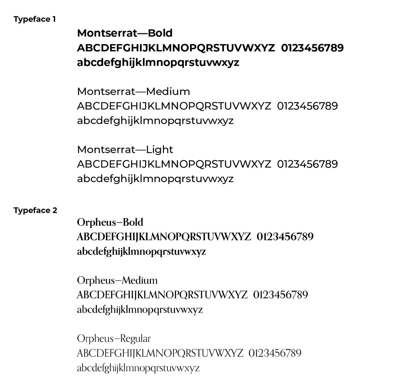
Triadic color as the final color choice
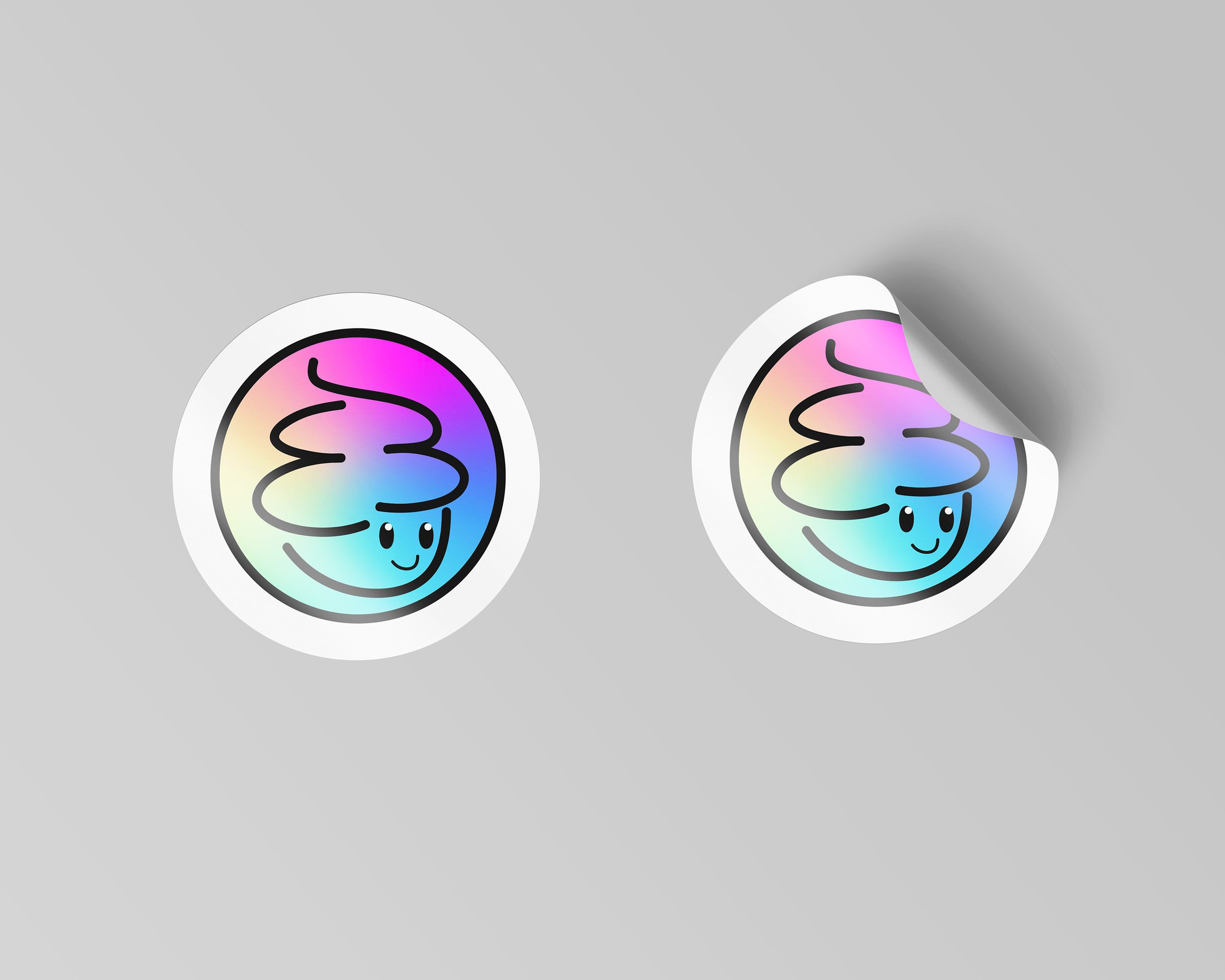
Final Logo
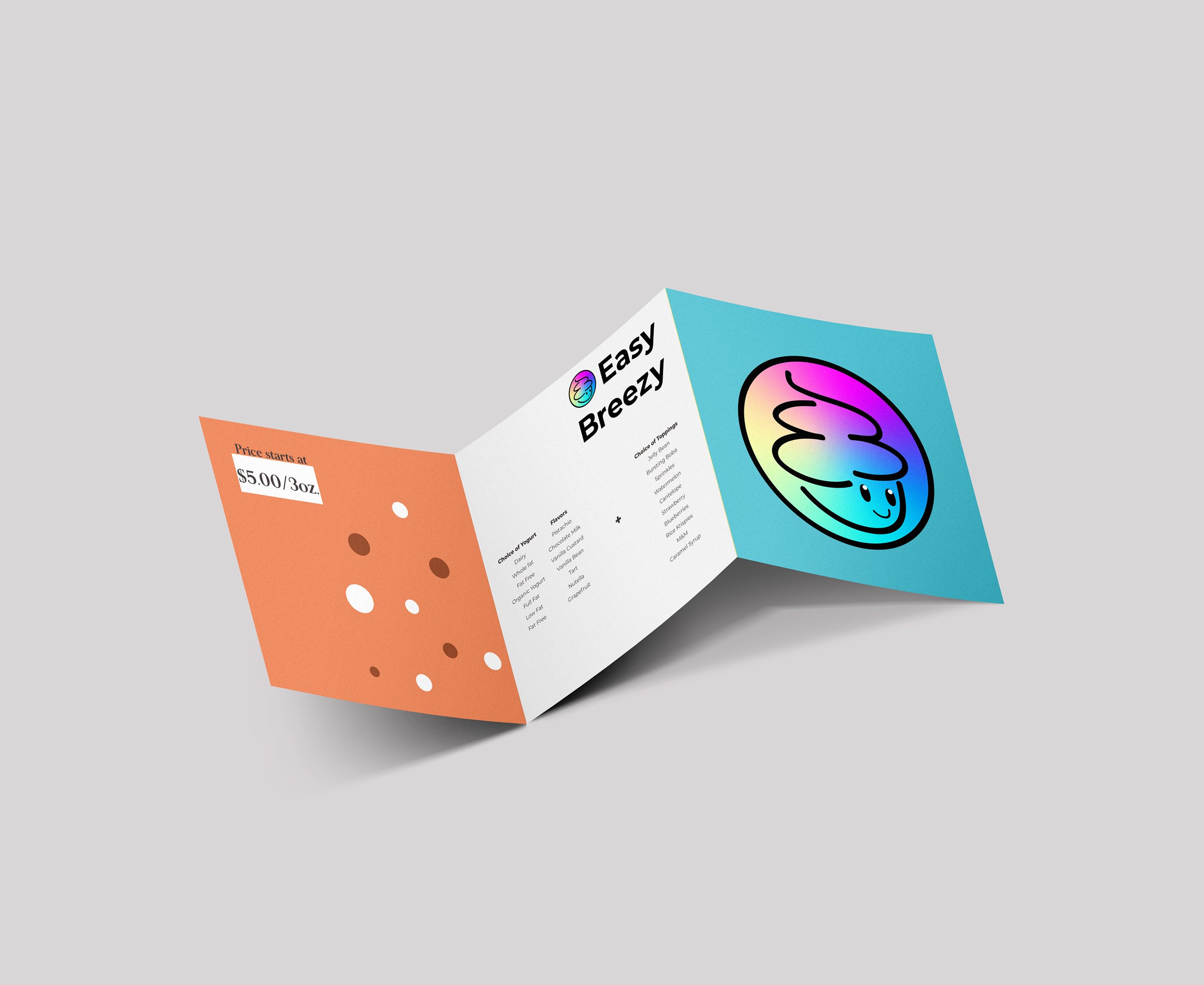
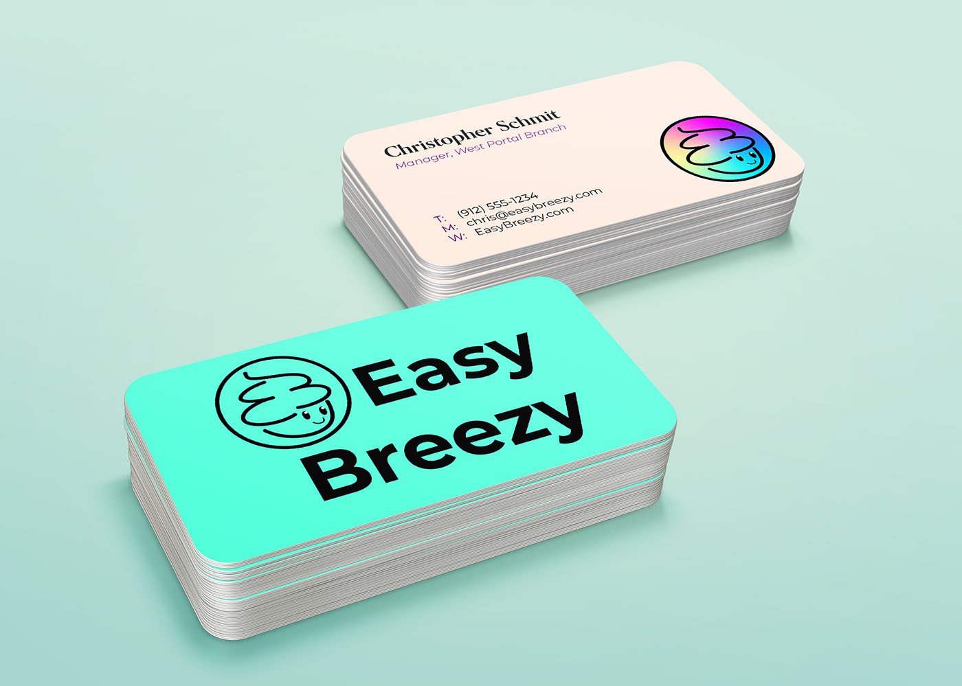
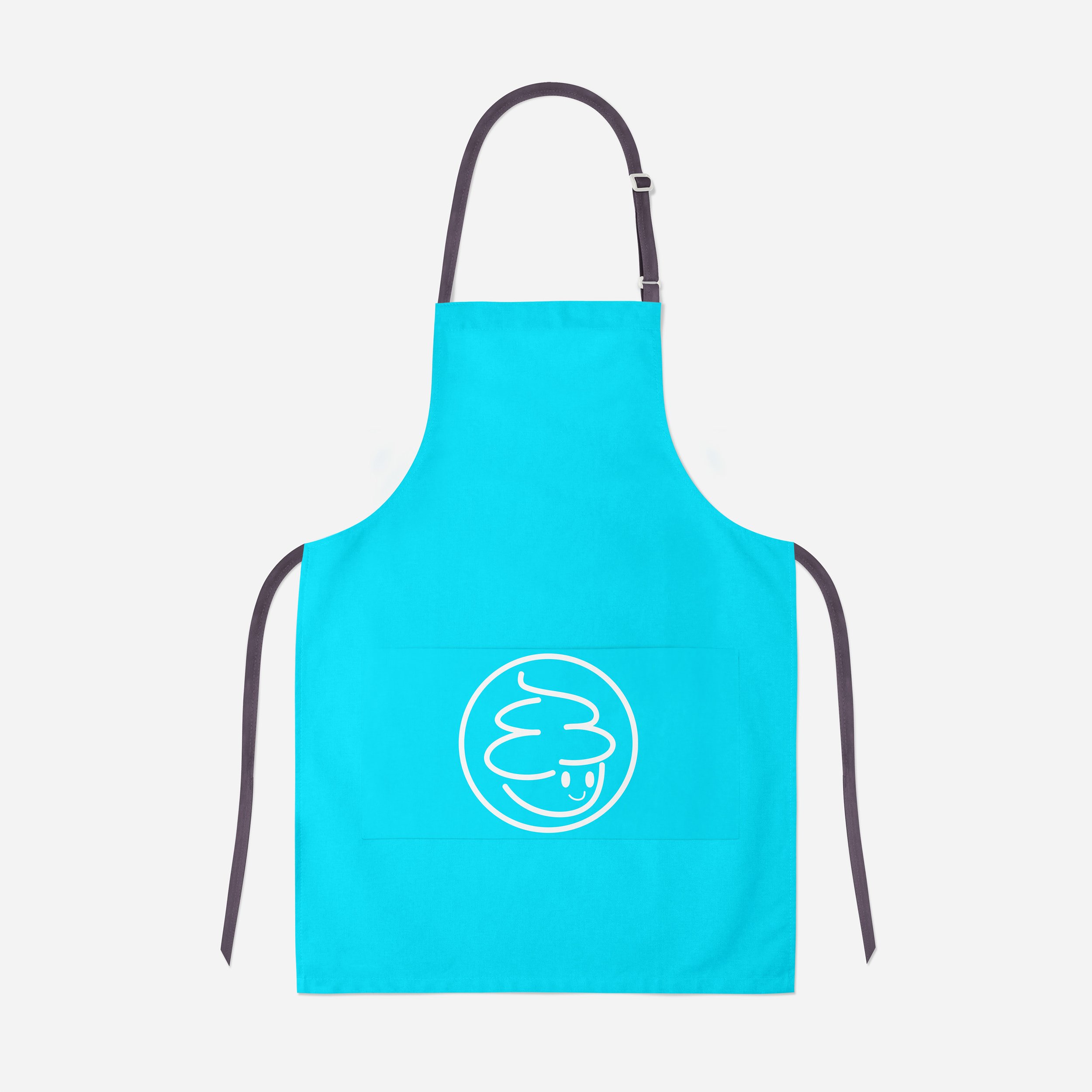
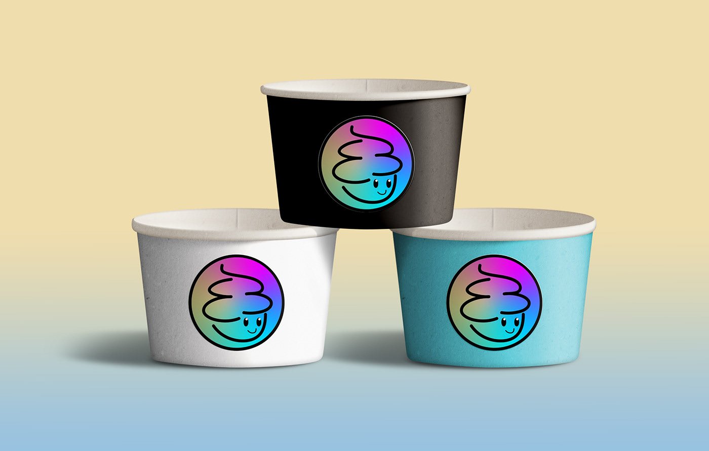
Final Mock up
Check out my other works!
-
Product Design
I have range of visual design and interactive project see more of my work!
