TAZO Tea
Packaging Design Series
Project Brief
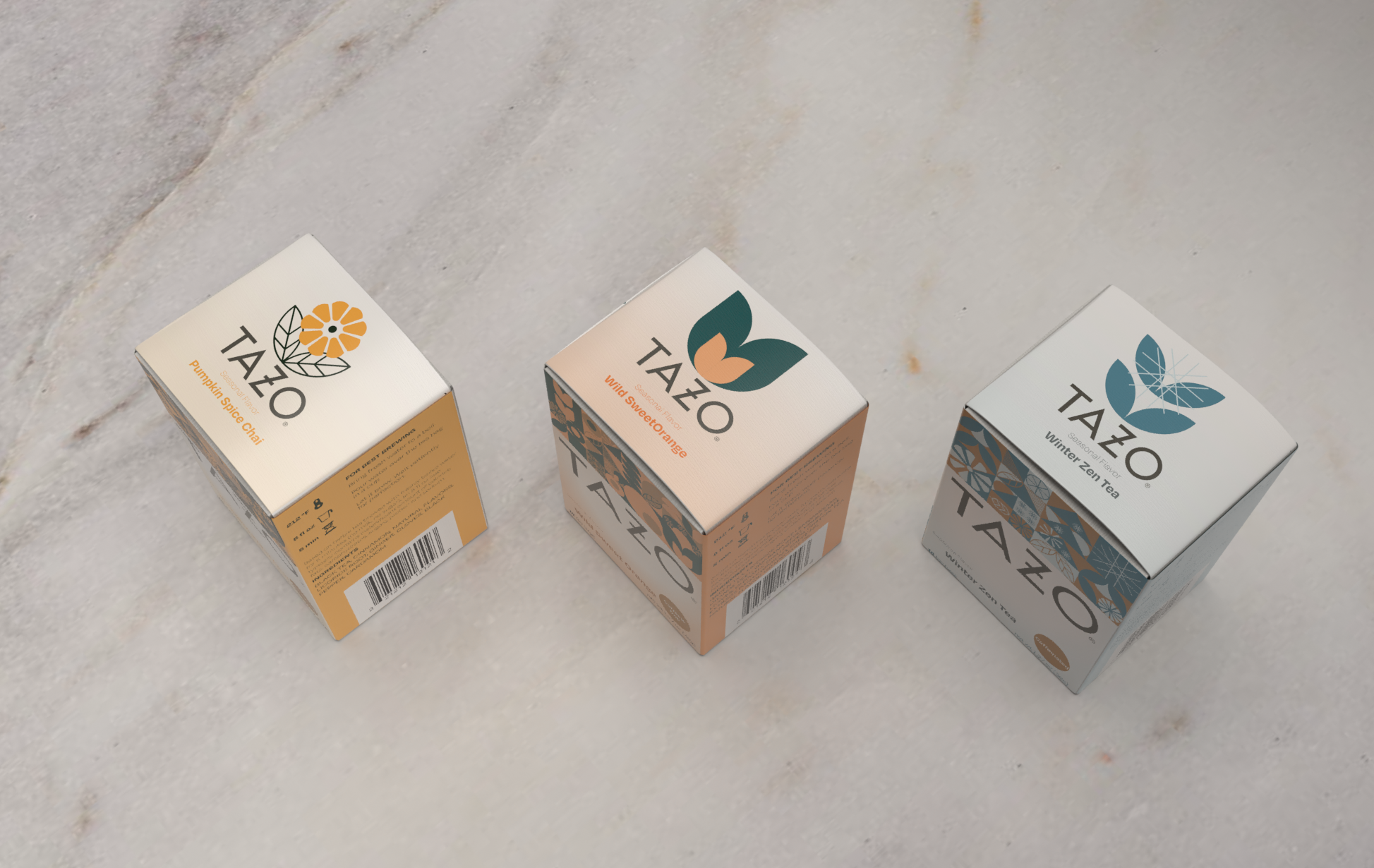
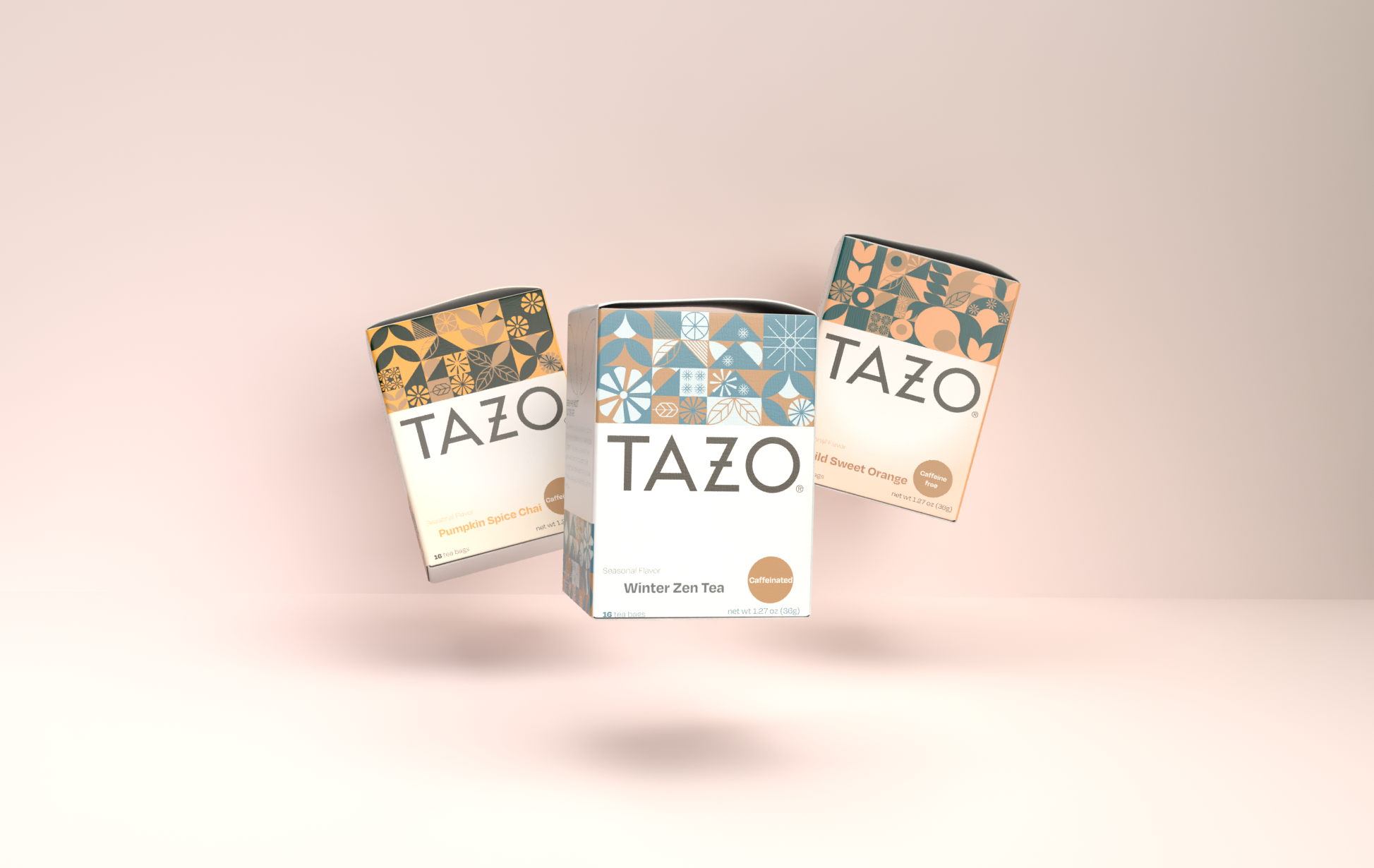
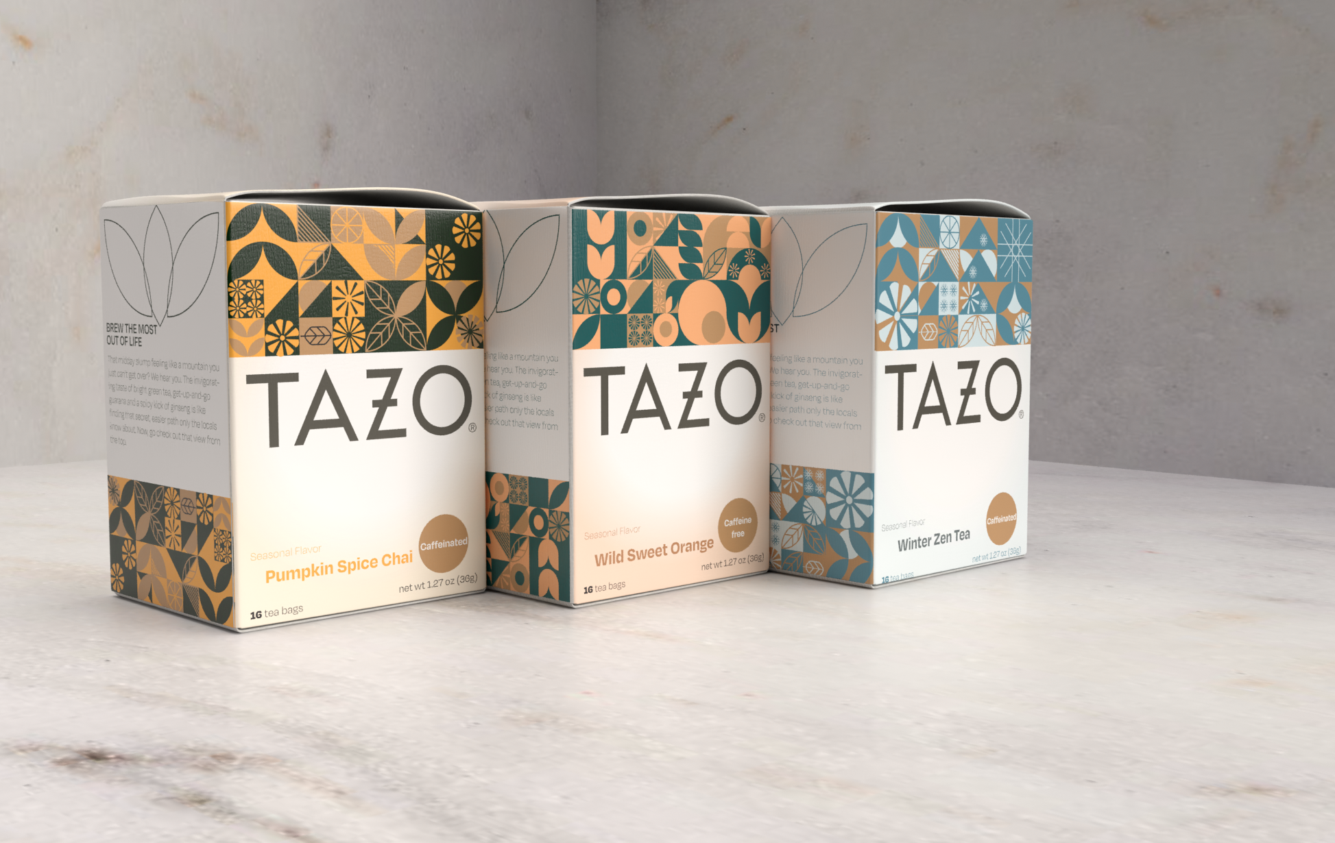
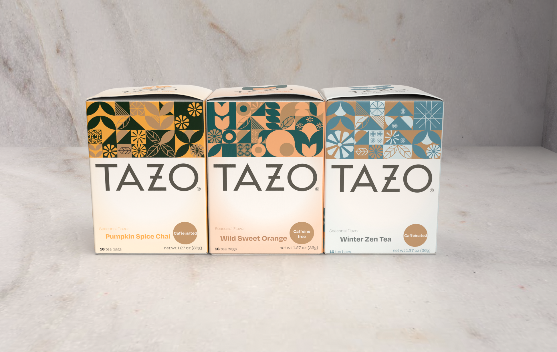
The goal of this project was to design series of three packages for a product: Tazo tea. Exploring three-dimensionality of the package itself.
Project Overview
The design calls for a new packaging for TAZO Tea.
The theme focused on seasonal TAZO packaging.
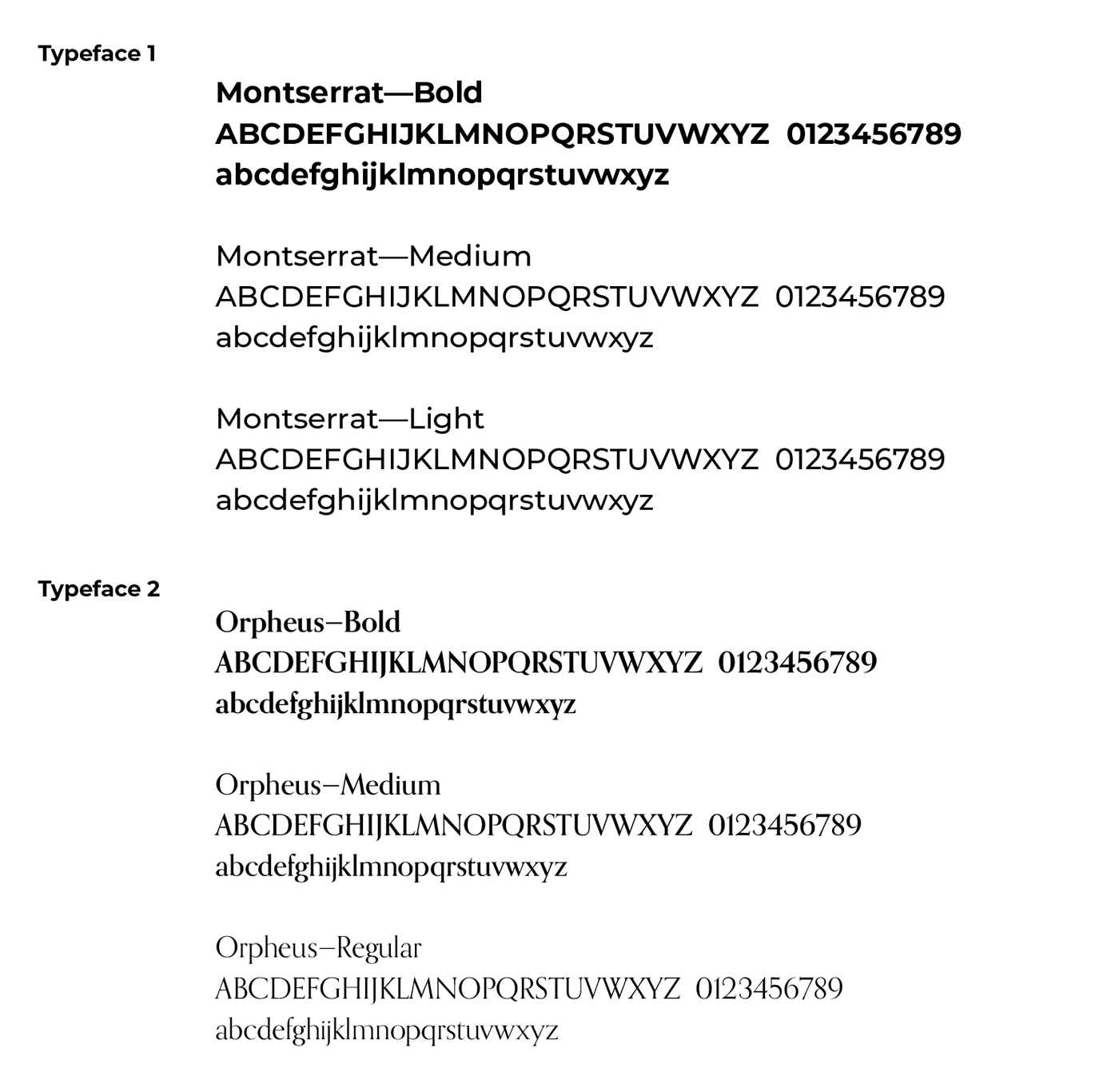
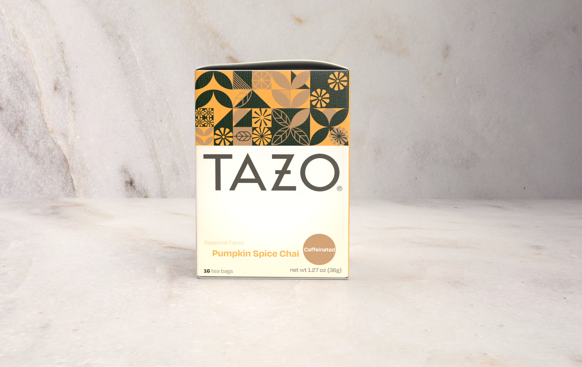
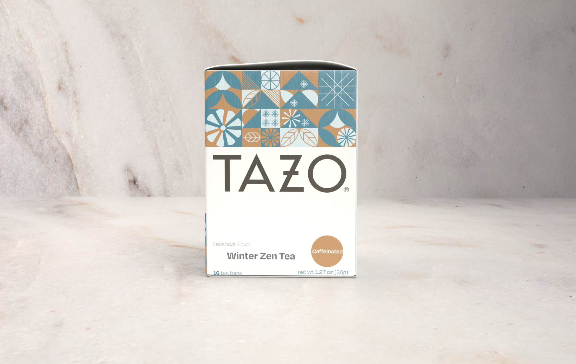
Allowing a series of flavors incorporated with Fall, Winter, and Spring flavors. Redesigning seasonal flavors comes with creative cohesion with the rest of the packages for the existing design of TAZO. Graphical elements used were inspired by the ingredients and relative flavors seen during those seasons. The simplicity of typography has flexible type weight for variation and overall connection with the brand’s minimalist approach. Customers will be inspired by its initiative promoting green practices with the use of recycled material and water-based color prints, local use of ingredients, and experimenting on the next flavor that TAZO is known for which remains honest and good practices in serving their community.
Duration
2-3 weeks
Role
Lead Designer
Outcome
This project was presented in Graphic Design II: Typography
Tools
Photoshop | Illustrator | Indesign | Dimension
Existing Packaging
SWOT Analysis
Strength
Vibrant colors across the shelf display.
A variety of flavors can be utilized to the overall design of the package.
Weaknesses
It came across as overly minimalist on the half part of the package with a lot of unused negative space.
Opportunities
A lot of white space could be utilized for other design elements.
Threats
The overall design felt too generic as well when viewed on the shelf of the market.
Competitor Profile
NUMI
Competitor analysis and brands on this level of market.
Numi Organic Tea is a privately owned triple bottom line social enterprise in Oakland, California. Numi is known for its assortment of organic and fair trade certified teas and herbal “teasans.” The company was founded in 1999 by brother and sister Ahmed Rahim and Reem Hassani. The founders named the company “Numi” after the citrusy, Middle Eastern dried lime tea they drank as children growing up in Iraq. The name Numi is derived from the Arabic word for citrus. The J.M. Smucker Company holds a minority stake in Numi.
Numi’s teas are all USDA certified organic, and several are Fair Trade certified. Numi was named the leading brand purchaser of Fair Trade Certified teas in the United States in 2010.
Numi blends organic and fair trade certified tea leaves and herbs exclusively with real ingredients, leaving out artificial flavorings, “natural” flavorings, and fragrances commonly used in food & beverage products.
Numi sells bagged tea, loose leaf tea, iced tea, gift items, and other tea-related products.
SWOT Analysis
Strength
Vibrant colors across the shelf display.
A variety of flavors can be utilized to the overall design of the package.
Weaknesses
It came across as overly minimalist on the half part of the package with a lot of unused negative space.
Opportunities
A lot of white space could be utilized for other design elements.
Threats
The overall design felt too generic as well when viewed on the shelf of the market.
Competitor Profile
NUMI
The Mighty Leaf Tea Company is an Emeryville, California-based specialty tea maker and distributor. Gary Shinner and Jill Portman, a husband and wife partnership, launched Mighty Leaf Tea in 1996.
The corporation distributes tea through wholesale, retail, and internet sales channels.
Mighty Leaf sells whole leaf tea pouches and loose leaf tea, which includes black, oolong, green, white, and herbal teas.
Mighty Leaf Organic Breakfast tea was declared the “best, basic black tea” by Cooks Illustrated magazine in 2007.
Mighty Leaf Logo
SWOT Analysis
Strength
Vibrant colors across the shelf display.
A variety of flavors can be utilized to the overall design of the package.
Weaknesses
It came across as overly minimalist on the half part of the package with a lot of unused negative space.
Opportunities
A lot of white space could be utilized for other design elements.
Threats
The overall design felt too generic as well when viewed on the shelf of the market.
Brainstorming
Reflecting on what I have incorporated in the brand redesign. The sketches refines the mascot of the yogurt and simplifying its form.
Rebranding Design Concept
Digital Iteration
Final Logo
Final Mock up



Check out my other works!
-
Product Design


