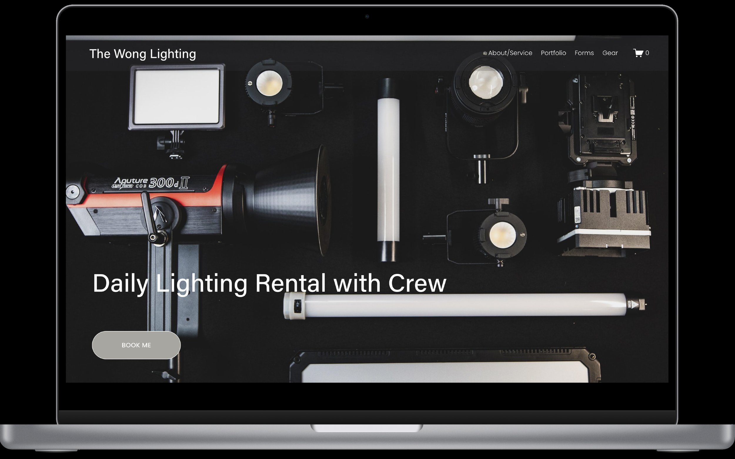
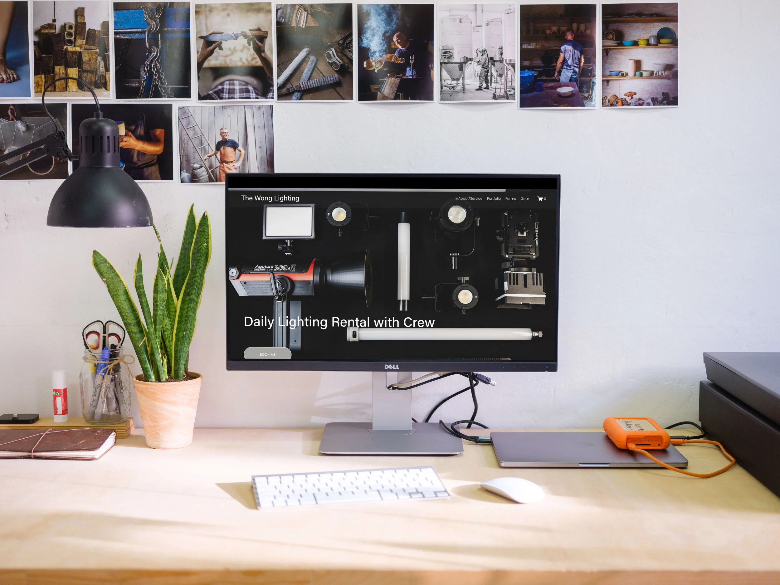
The Wong Lighting
Branding and Online Film Gear Rental Platform
01
PROJECT OVERVIEW
Project Brief
Rental service for film lighting branding and website.
Overview
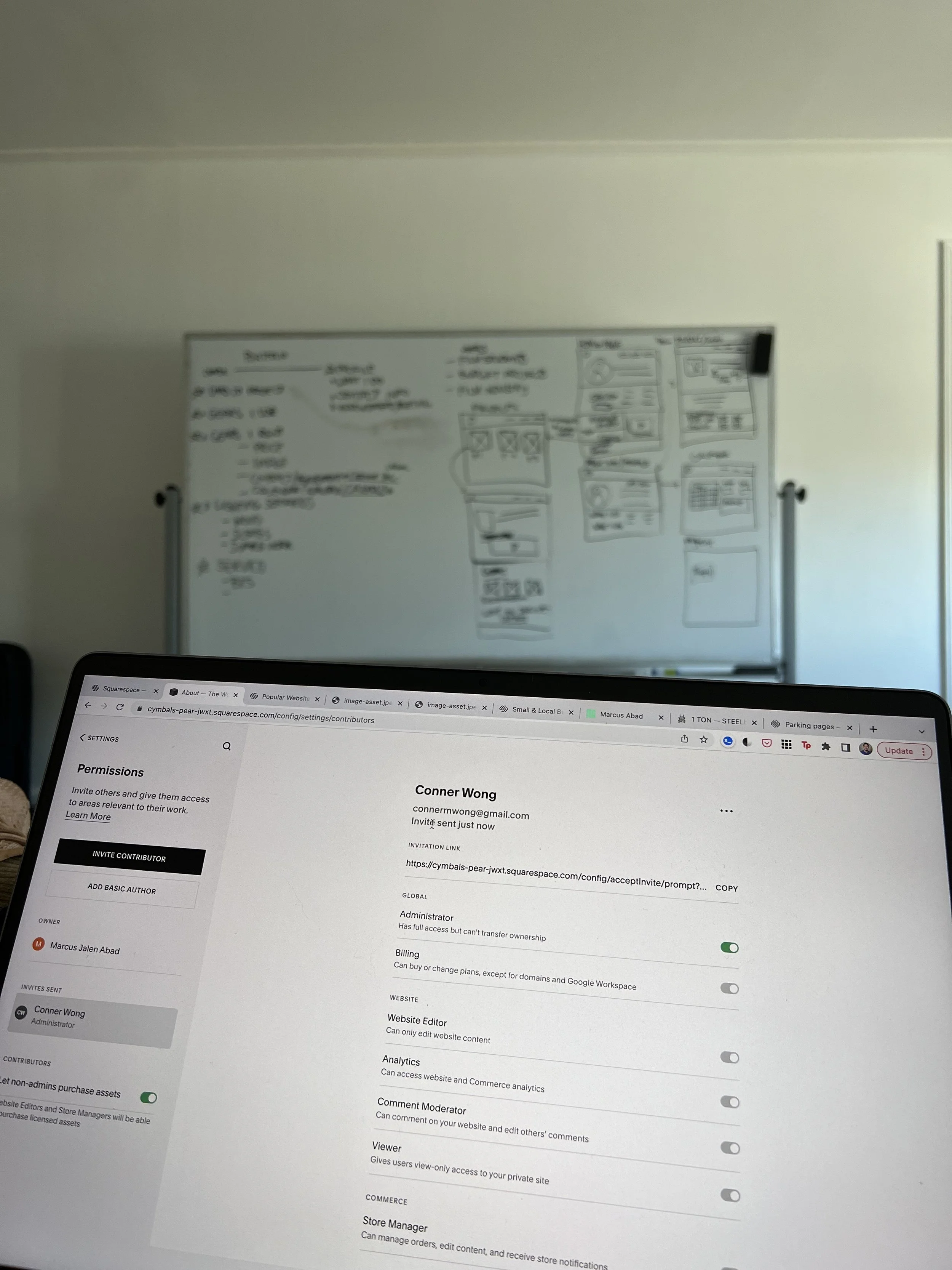
As a skilled designer, I spearheaded the development of a responsive platform and established a compelling brand identity. Through a collaborative partnership with small business owner Conner Wong, I empowered him to deliver an enhanced customer experience by seamlessly integrating a range of services and tools into his website.
Responsibilities
User research, visual design, wire framing, prototyping, user testing, photographer, video editing,
Role
Lead UX Designer, Researcher, and User Interface Designer
Outcome
This project involved commissioned work for the creation of a dynamic live website and a distinctive brand identity that effectively represents and promotes the business.
Tools
Figma | Photoshop | Illustrator | Miro | Canva | Google Sheet & Forms
Background of the project
The Problem
In the film industry, a major challenge arises in the realm of tool rentals. It becomes increasingly arduous to locate reliable and cost-effective rental companies that cater to the specific equipment requirements of each project. Compounding the issue, many rental companies have limited availability or demand long lead times for reservations, posing significant obstacles for filmmakers operating within tight production schedules.
The Goals
The design goal is to develop a centralized platform for film rentals that offers filmmakers a seamless experience in searching for and reserving necessary equipment, while providing owners with an efficient system to manage inventory, reservations, and transactions. The platform should prioritize user-friendliness, offer real-time availability and pricing information, and facilitate effortless communication between renters and business owners. While establishing a brand for the business in its local film community.
Project Kickoff
In this case study, brainstorming design approaches to address challenges users will be most effective for design solutions. Qualitative and quantitative research methods would be the most effective. Using user surveys, competitive analyses, literature reviews, and user interviews to define persona hypothesis construction.
What is the current challenges in online rental experience?
What business challenges is the owner facing prior to establishing a website?
Who are the competitors in the local community with the same service?
What challenges could we face moving forward?
Which users are the most important to the business?
What current shopping experience does the user face?
02
Understanding the user
User Research
Personas
Problem Statements
User Journey Maps
UX Research Process
Interviewed the business owner about the tools available for him to rent. The challenges they are facing without an established webpage for his business.
Through his personal experience, we are able to navigate the challenges his clients were facing and the need to have an online platform.
To identify user pain points and the core experience of the mobile application, I moved through affinity mapping to sort out common issues and categorize how user act, thinks, say, and feel when shopping online for furniture.
Second Affinity Mapping was done to shape the information architecture of the application. Understanding the flow of browsing experience, transaction, AR feature, and buyer/vendor interaction process.
AFFINITY MAPPING

It is observed that 16 out of 22 surveyed participants experience difficulty buying online ranging from customer experience, product assembly, unresponsiveness from sellers, and how the furniture would look like on their space.
3 out of the 5 interviewees suggested communication with sellers as a form of the legitimacy of the product.
10 out of the 10 interviewees were knowledgeable about the mentorship but not able to acquire a consistent network of people that matches their needs.
Finding common themes
It is observed that 5 out of 5 participants had experienced misleading images of the product compared to what they receive.
“Shopping for furniture during a pandemic is hard when everything is shut down. Online shopping is the way to go, but sometimes its frustrating and deceiving when I receive my product.”
Pain Points
EASE OF USE
13 participants responded with the importance of having ease of transaction. Collecting payment information for purchase and readily available for them use for their next transaction.

INTERACTION
9 users felt the need to interact with vendor for further information on product info and delivery options.

ACCURACY
Photos, price, Listing date and reviews were important to 16 users. Allowing for an actual product images they are to purchase. With 5 users had difficulty with their furniture purchase because of photo inaccuracy.

WAYFINDING
Plenty of information displayed on the observed application creates a bad user experience, mitigating this through simplified, easy-to-use, and modernized way of the browsing experience.
How might we?
How might we design a localized furniture app to increase users' online shopping confidence?
Hypothesis
If users can quickly be informed with product knowledge by incorporating accurate product communication features to sellers, then customer experience will information overload and increase their shopping confidence.
Creating Rick, as the user persona

AGE: 32
Education: Business Major
Hometown: San Jose,CA
Family: Lives with his partner
Occupation: Full-time Sales
“I used AR to make the sofa will fit my living room and matches the entire interior decor.”
Rick appreciates new home decor with his partner and has an opinion when making a purchase. It can be tricky to buy something online and not be able to get a feel of it first, especially now that they can’t go out as much. He noticed a lot of significant differences at home since he works from home full time. A lot of changes are needed, and wanted to keep his working environment as productive looking as possible.
Aspiration:
The user felt the need to use innovative aspects of online shopping.
Rick felt at ease when getting the correct home furniture sizes buying from his local neighborhood.
Frustration:
Heavy items were delivered to my home, but I knew what I expected.
The weight of the product can be troubling and bulk so knowing the volume is so important if it’s going to fit my apartment.
Problem statement:
Rick Ang is a work-from-home Sales Manager who needs to make a furniture purchase online because of COVID-19 restrictions, he’s unable to visit a regular shop.

User Journey
Understanding common phases of shopping online. I wrote down tasks users encountered and learned about their struggles when users cannot visit an actual showroom or store to shop.
03
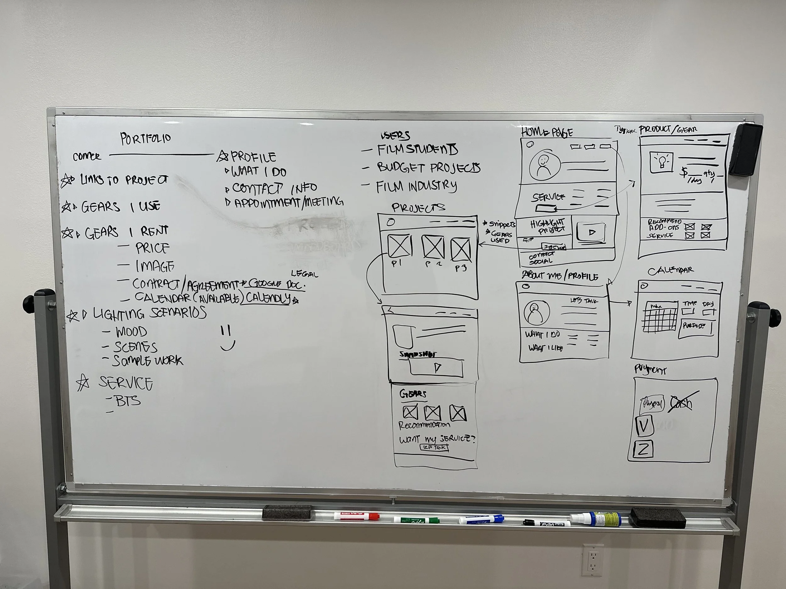
Starting the Design
Paper Wireframes
Digital Wireframes
Low-fidelity Prototype
Usability Studies

Ideation
Using CRAZY 8’s
With the ideas flowing through brainstorming, I quickly drew 8 distinct landing pages as the base concept.
In this session I concluded:
Different approaches along the way will help shape the mobile platform.
Interactions were assumed to follow a common flow of browsing, product knowledge, transaction, and later phase of communicating with the seller.
Adapting to new technology such as Augmented Reality embedded in the product overview will help visualize the furniture shopping experience.
Paper Wireframes
Iterations
Low fidelity Prototype
Digital wireframe
Conceptualizing potential design system, interaction and functionality to be incorporated in the overall user experience flow.
Information Architecture
In order to create a user flows, understanding the each landing pages functions and actions through formatting the Information Architecture of the app.


Usability Studies
With early testing, the low fidelity prototype helped with the missing parts of the design. Including functions that is necessary for users. With two rounds of testing, 5 users reviewed the app and provided essential feedback for the mockups.
First Round Findings
User’s were a little bit confused without descriptive text on wireframes.
3 out of 5 users had accessibility issues and suggested contrasting buttons.
Users responded to the wireframes by moderated assistance due to lack of visual references.
Second Round Findings
5 out of 5 users felt loss on the screen, and suggested back buttons.
1 out of 5 users had technical issue with the connecting screens and required moderated assistance.
All users had difficulty with the click through prototype.
Findings in this session I concluded:
Early concepts require more visuals and interaction.
Prioritizing the accessibility concerns with careful use of text and iconography.
Providing users with the right visual cues to mitigate frustration with the overall user flows.
The user testing helps resolve issues early in the process of the prototype.
04
Refining the design
Mockups
High-fidelity Prototype
Accessibility
Design Systems

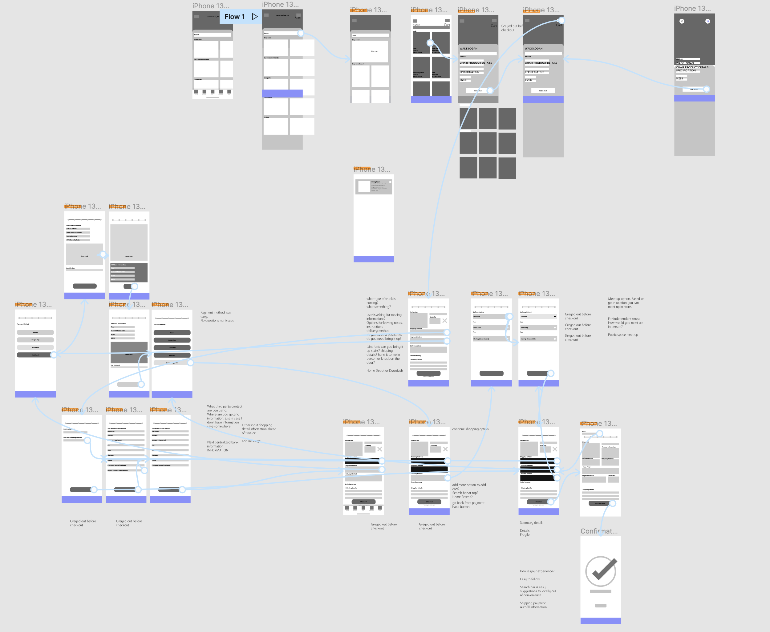
Mockups

High Fidelity Prototype
Sign-In Animation
Exploring screen animation during the log-in experience adds to the visual identity of the mobile application.
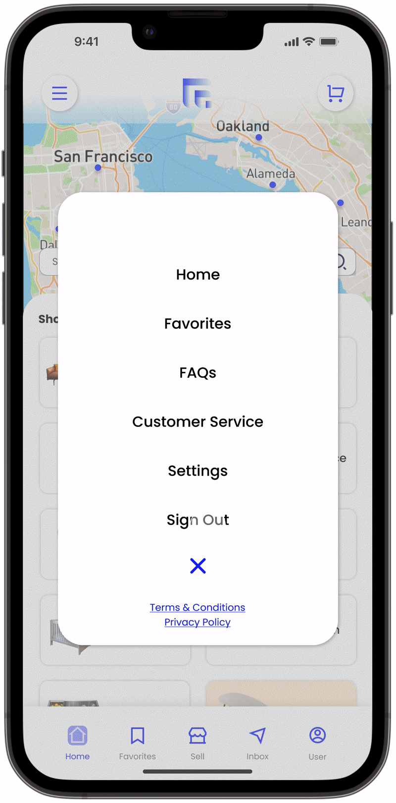
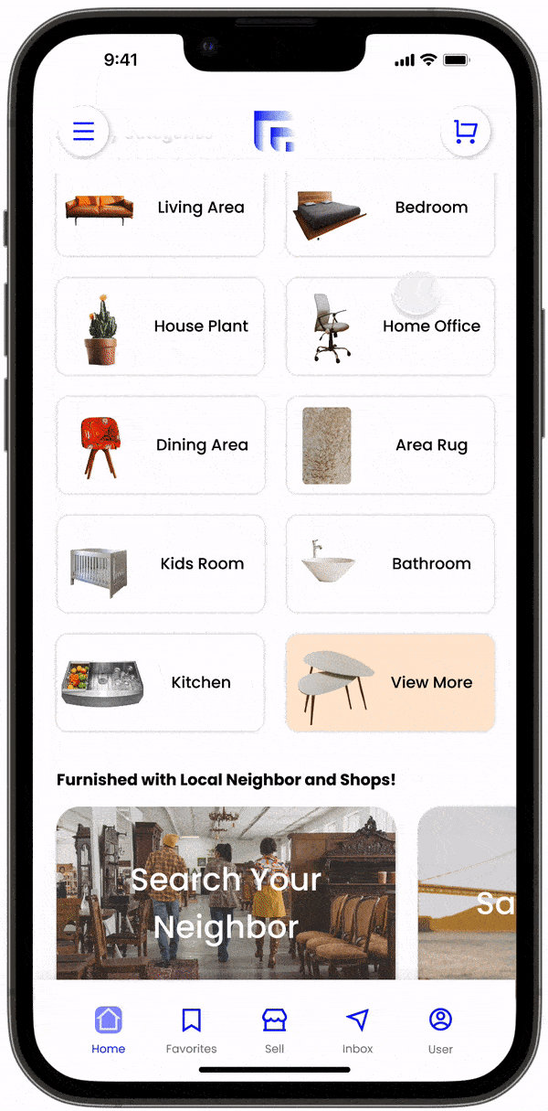
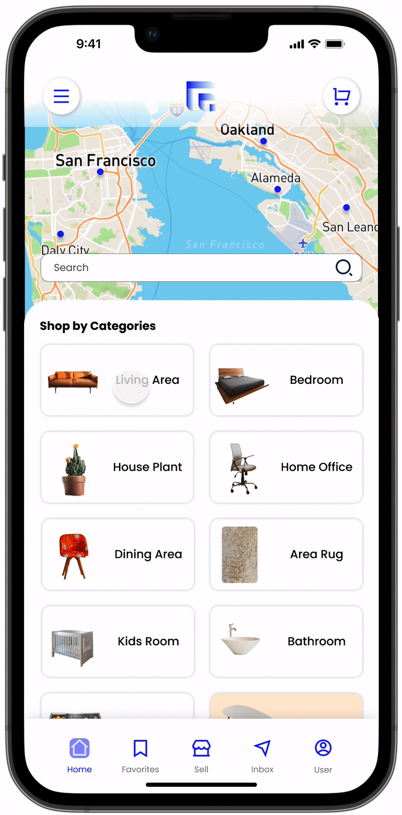
Main Screen
Offering to localize shop experience by adding interactive map for the user, easy navigation of furniture categories and brands, and consciously providing useful information about shopping locally and used furniture impacts.
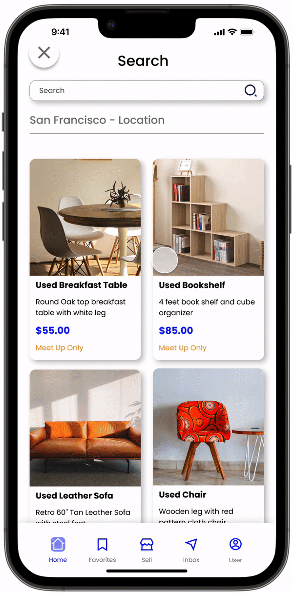
Search Screen
Navigable search tab and optimizing product search prediction for easy filtering.
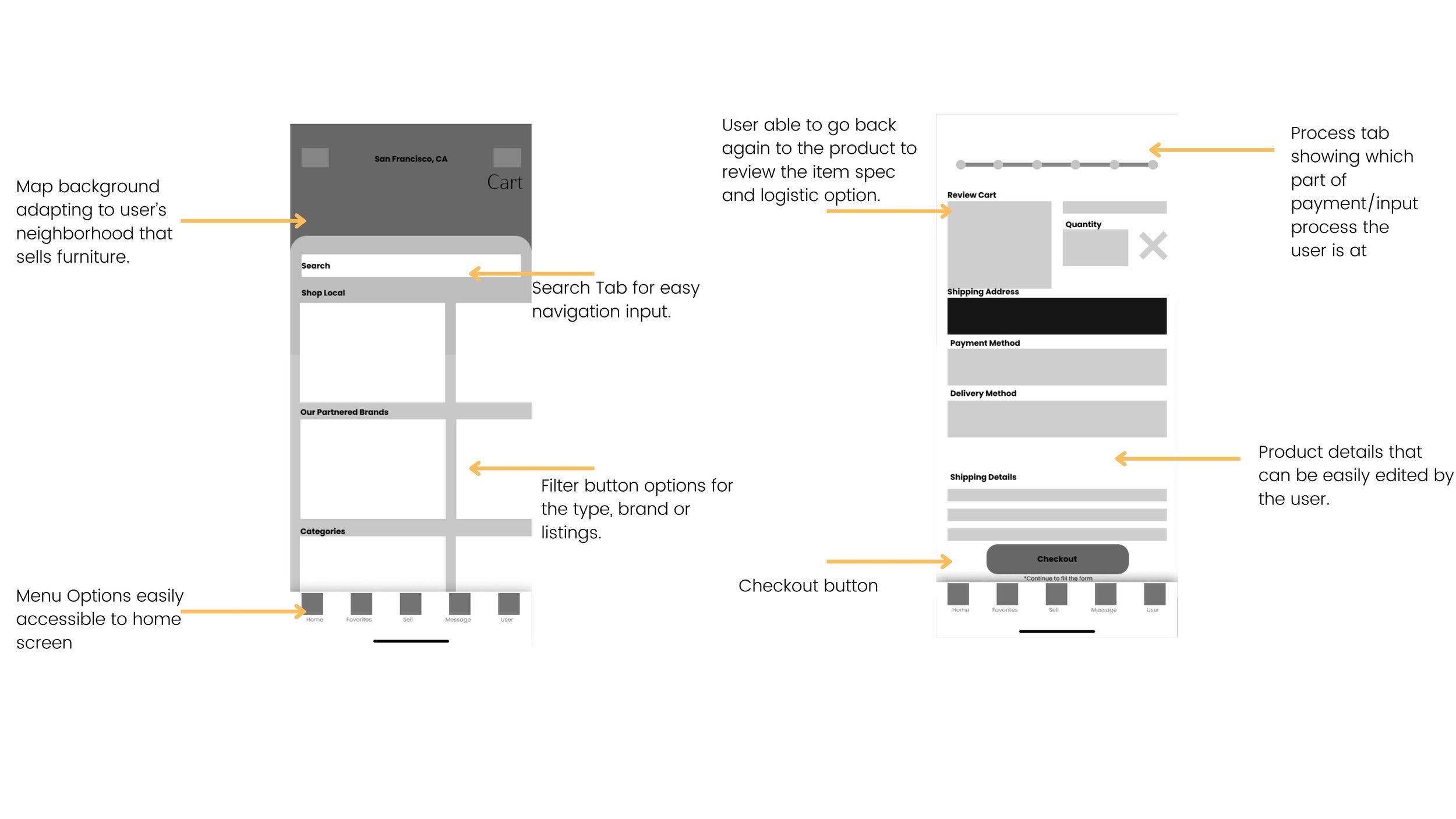
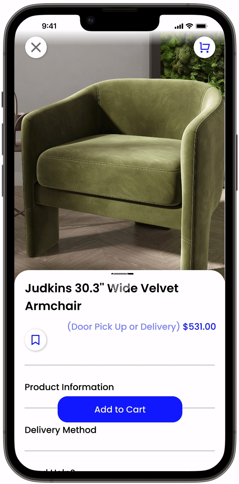
Product Screen
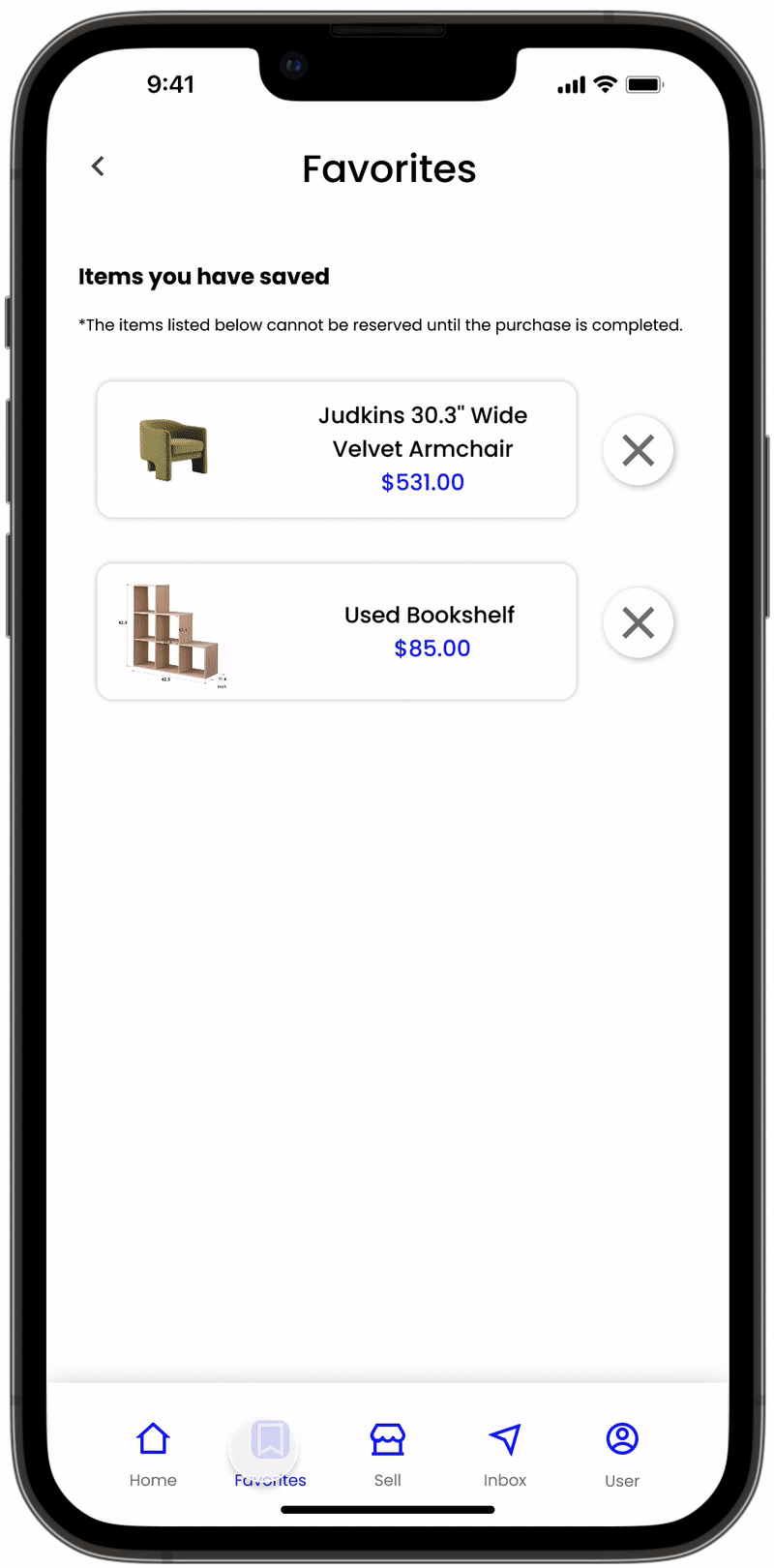
Offering simplified product screens reducing information fatigue. Image, pricing, product name, and interaction to add on favorites.
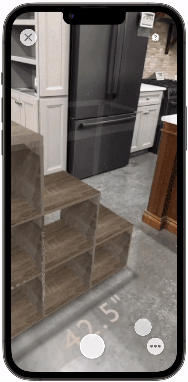
AR product Screen
Mapping furniture in the user’s space allows an additional form of buying experience and ensures customer confidence in
shopping online.
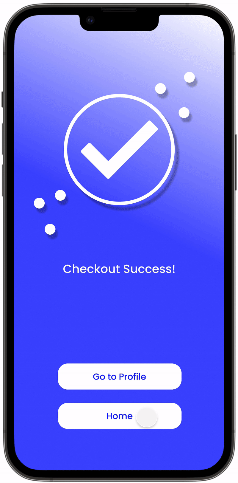
Fast Transaction
The interaction shows reduced click-through transactions for users to input information, allowing other forms of payment, scanning cards, and text entry.
Customer Messaging
Providing communication forms for users to interact with the seller.
Navigation Screens
Accessible navigation within each screen, careful incorporation of type and icons.
Reflection
Takeaways
I deep dive into Figma and Adobe Dimensions to curate the app interaction and integrate an AR experience for the prototype.
I learned that app design has customer and user experience considerations. For instance, I am championing CX through an honest and transparent view of the product while also helping them know the brand better. While the UX I designed for a smoother and more precise interaction with each step of the shopping experience.
If I had more time, I would consider exploring different products' system complexity through data gathering. How would the business model raise profit, such as a brand partnership in the furniture industry, eco-friendly marketing, or transaction fees?